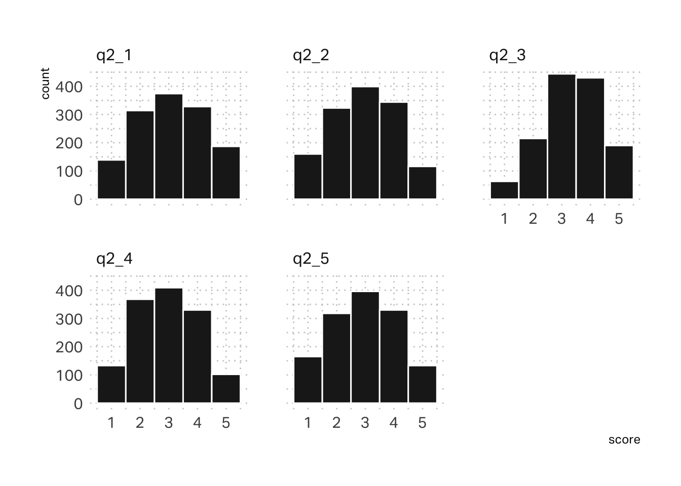
Right away, I notice that Q2 in the survey data doesn’t seem to be very differentiated. All of the scores gravitate towards a median of 3. Histograms suggest that the data follows a fairly normal distribution.
Code
df |>select(starts_with("q2")) |>gather(question, score) |>ggplot(aes(x=score)) +geom_histogram(binwidth =1, color ="white", fill = pal[5]) +facet_wrap(~ question)
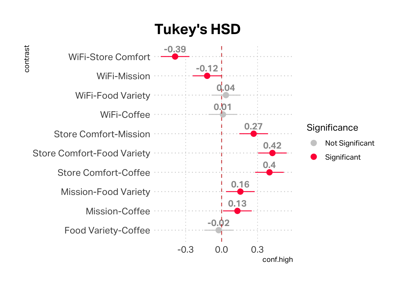
We can also check to see if there is a statistically significant difference between each of these scores using ANOVA and Tukey's HSD (Honestly Significant Difference). This analysis considers each pair of variables. Grey points are not statistically significant. From a statistical perspective, there is no difference in the mean scores between WiFi and Food Variety, WiFi and Coffee, and Food Variety and Coffee.
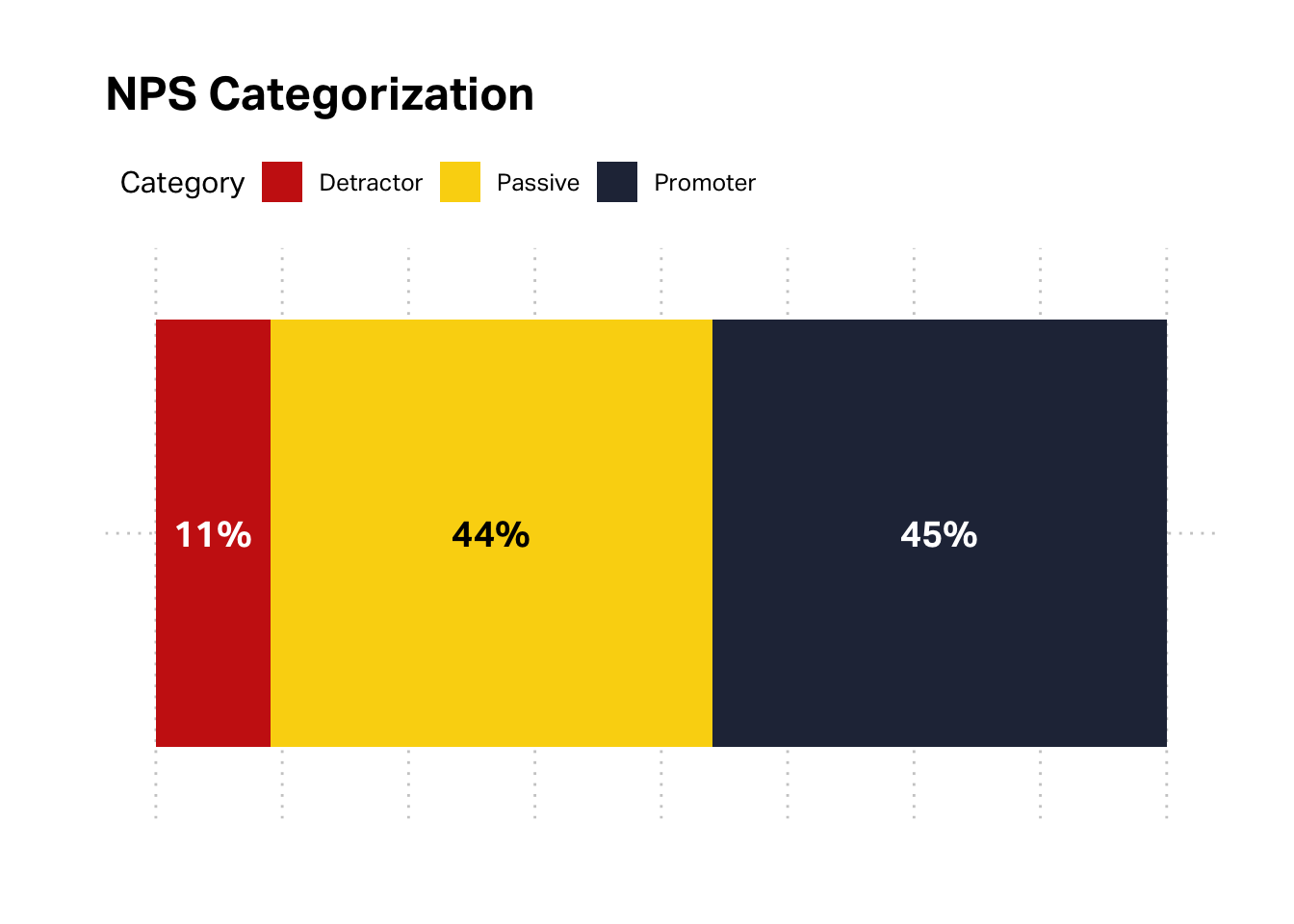
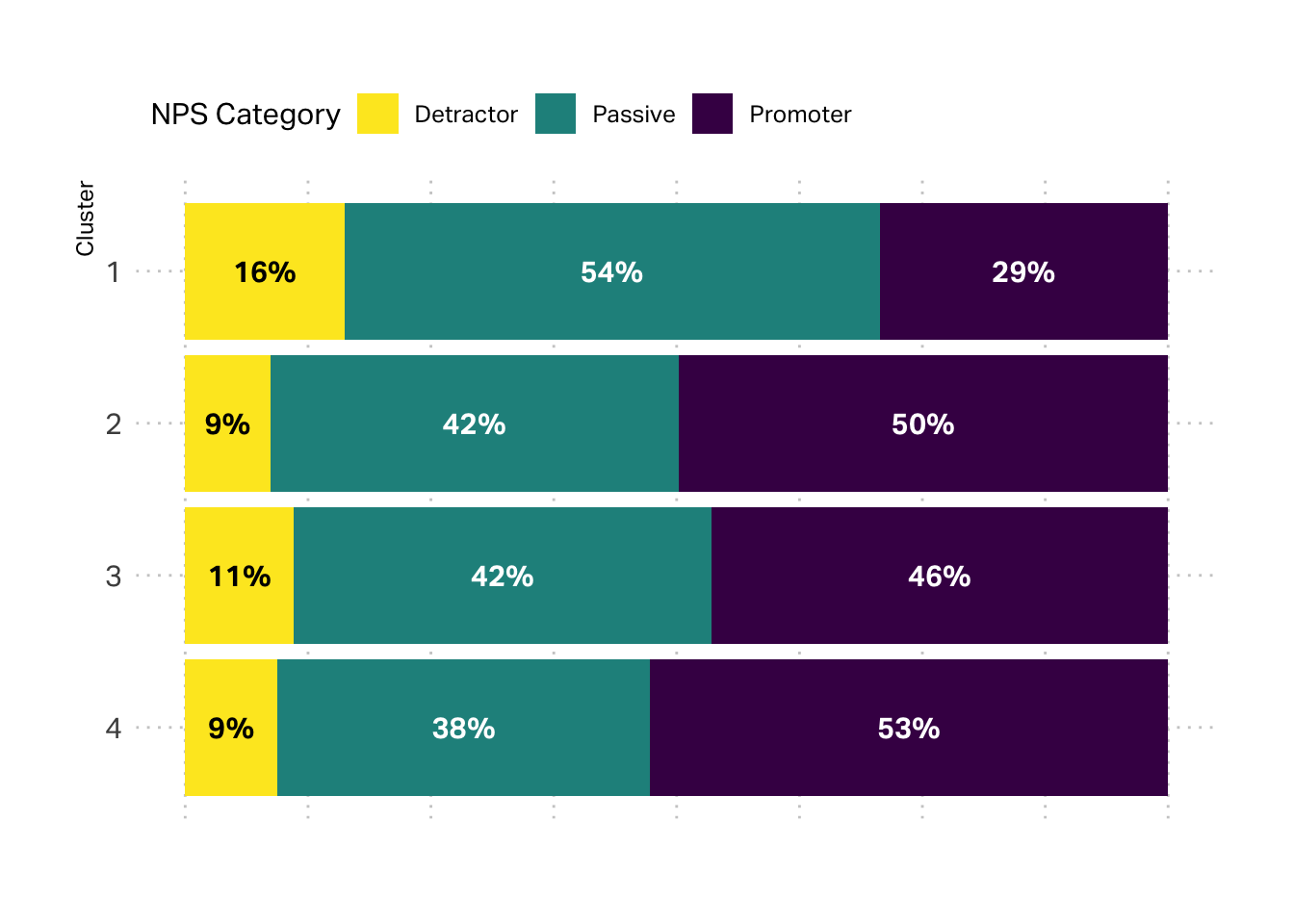
It is also helpful to us to turn our attention to two of the most important drivers of customer-centricity: profitability and satisfaction. We can start with satisfaction, by considering the NPS data. The overall NPS is 34%, but we glean a little more insight by unpacking it’s component parts.
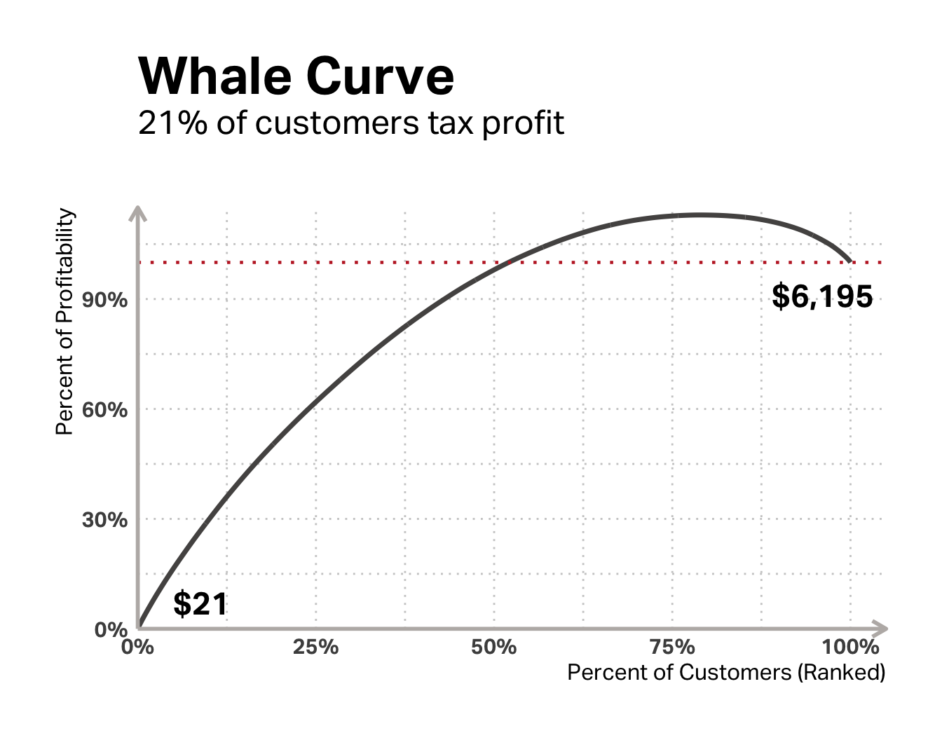
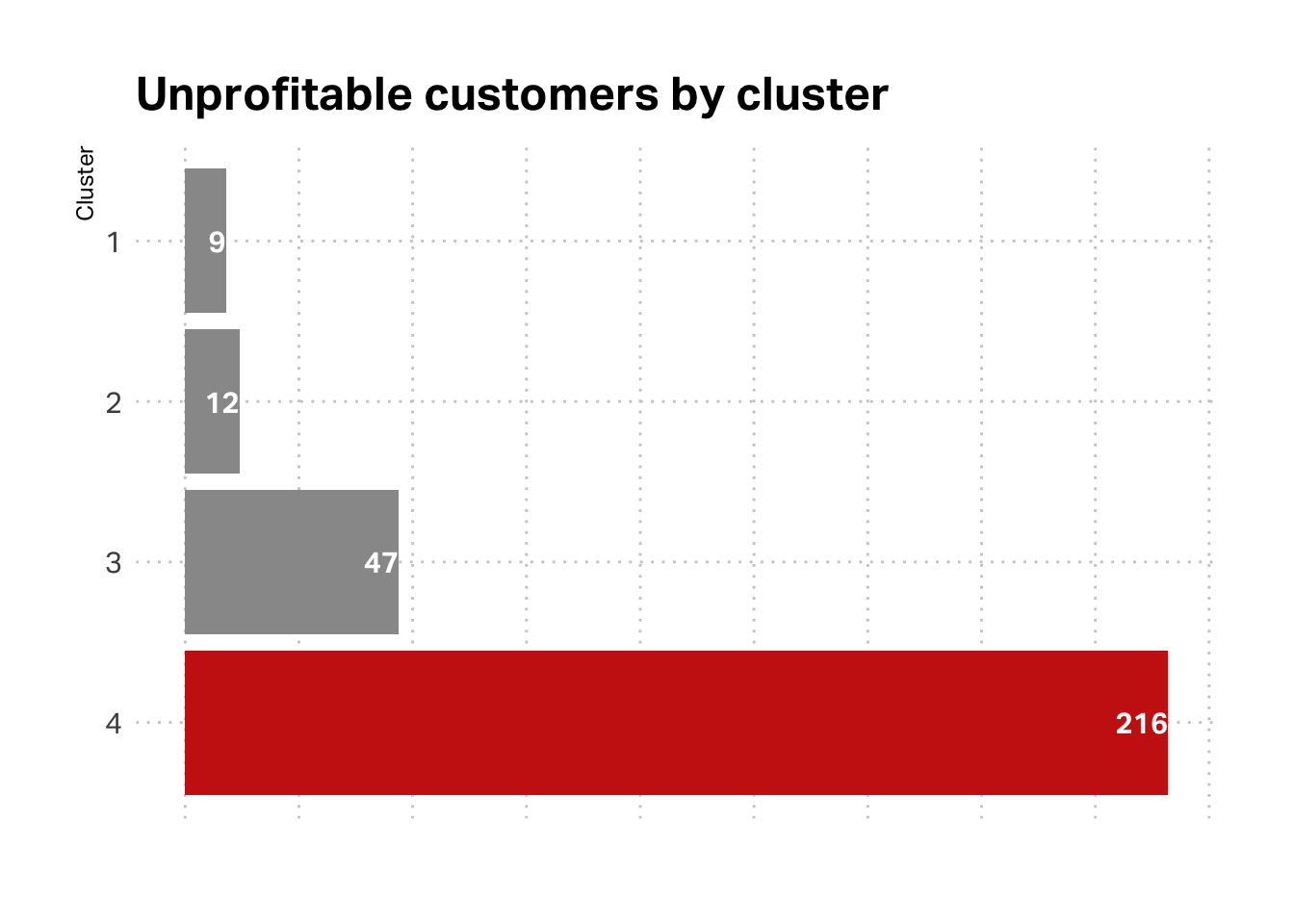
As for profitability, the per_cap variable can help. It measures the average transaction contribution. In our descriptive summary above, we saw that some customers cost us as much as -$13.47 every time they transact. Going back to the whale curve, we can see that about 21% of customers in this data set “tax” our potential earnings.
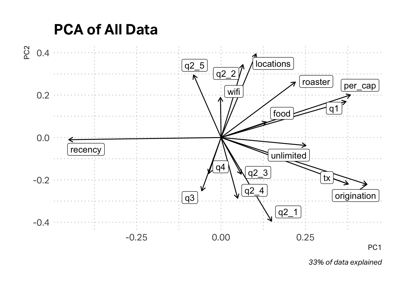
Our goal is to look for statistically significant segments or clusters in the data. We have a mixed dataset of numeric and categorical variables. In our numeric set of variables we also have some high contrasts (variables with very different scales). For example, origination has a maximum value of 784 and a minimum value of 1, while locations has a range of 1-13. These high variances can influence k-means, so it is wise to pre-process the data. One approach is to simply scale all of the numeric variables. While this approach is valid, plotting your results can be challenging with so many variables. For this reason, another approach is to pre-process the data using PCA. This has two advantages. First, it provides you with a new set of uncorrelated variables, but the second advantage is that it can often allow you to reduce the dimensionality of your dataset to just two principal components. These are easier to plot and visualize.
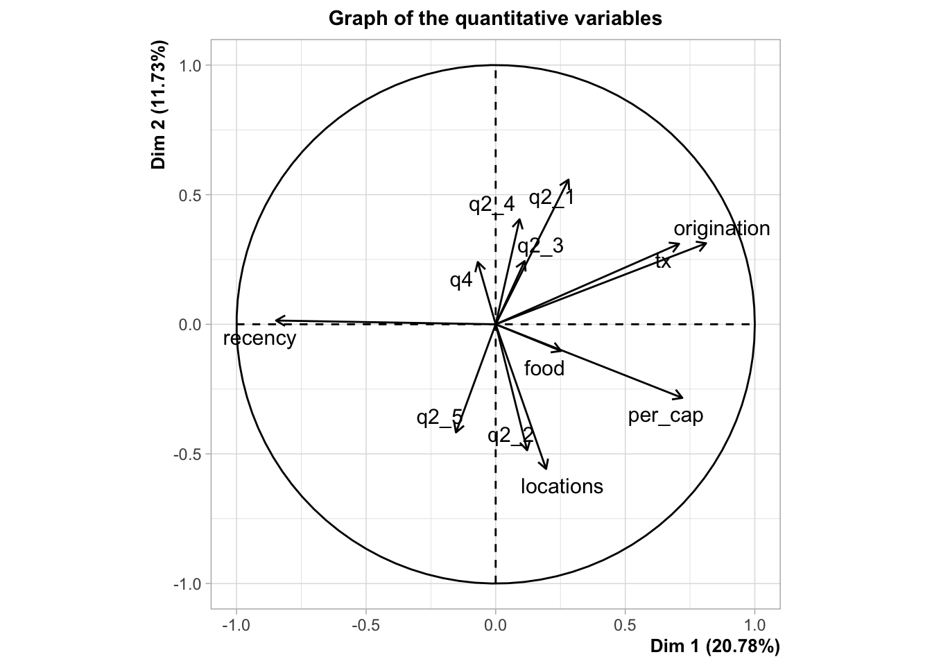
In the plot above, we obtain a high-level overview of our data. The arrows indicate the direction the data moves relative to a central point. This allows us to analyze which data are most correlated. For example, q3 (Follow on Social) seems to be inversely correlated with locations. To make this plot, I used only the first and second principal components (PC1 and PC2). If I used more components, I couldn’t have made the plot. The trade-off is precision. You’ll note that these two principal components explain only 33% of the data.
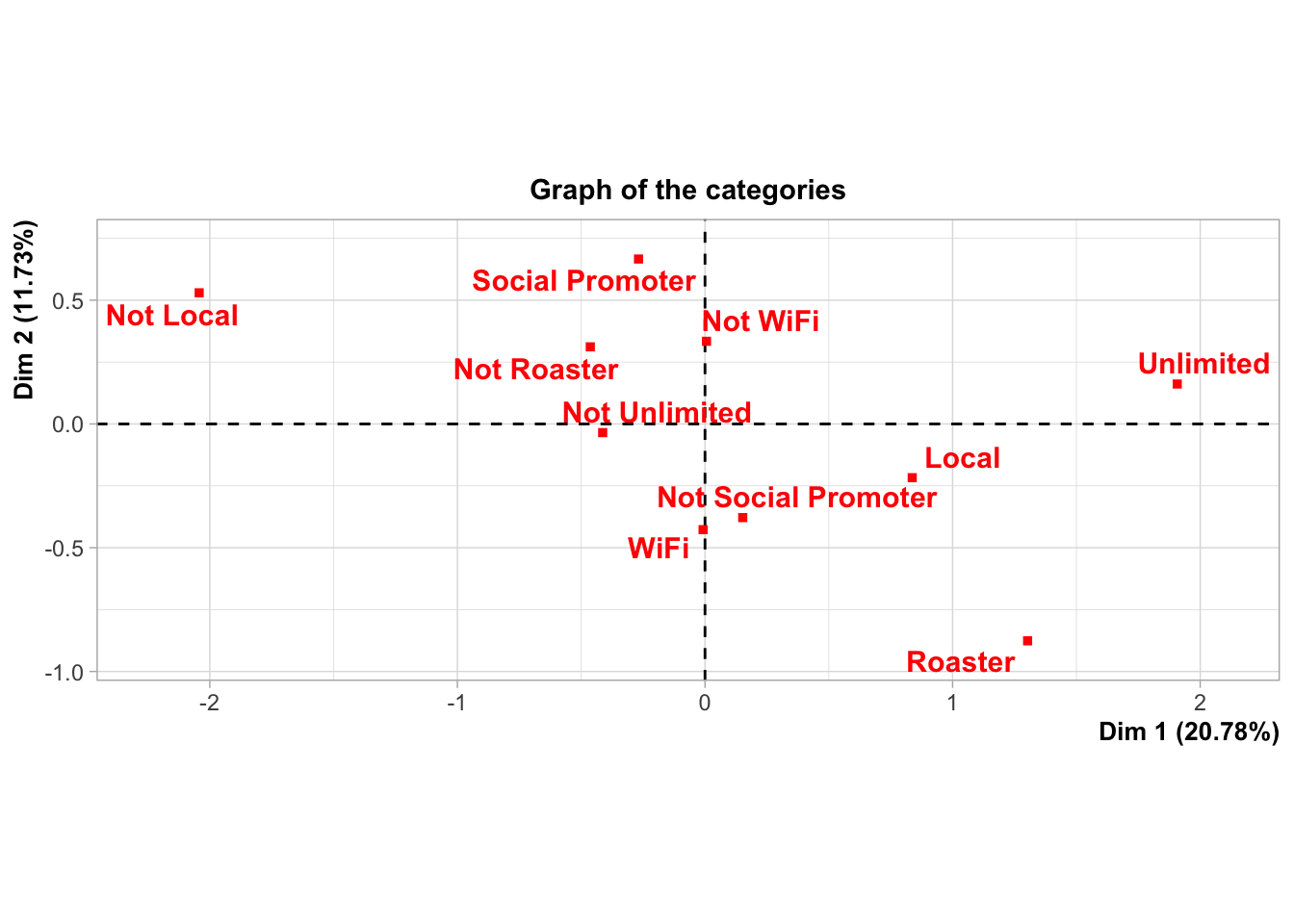
The biggest issue with the plot above isn’t the lack of precision, but the fact that I used PCA on a dataset mixed with numeric and categorical variables. Categorical variables don’t really satisfy the conditions necessary for PCA. The unlimited variables is binary. A customer either is a member or they are not. There is no point between zero and one in reality. This nuance can lead us astray when we input our pre-processed data into k-means for clustering.
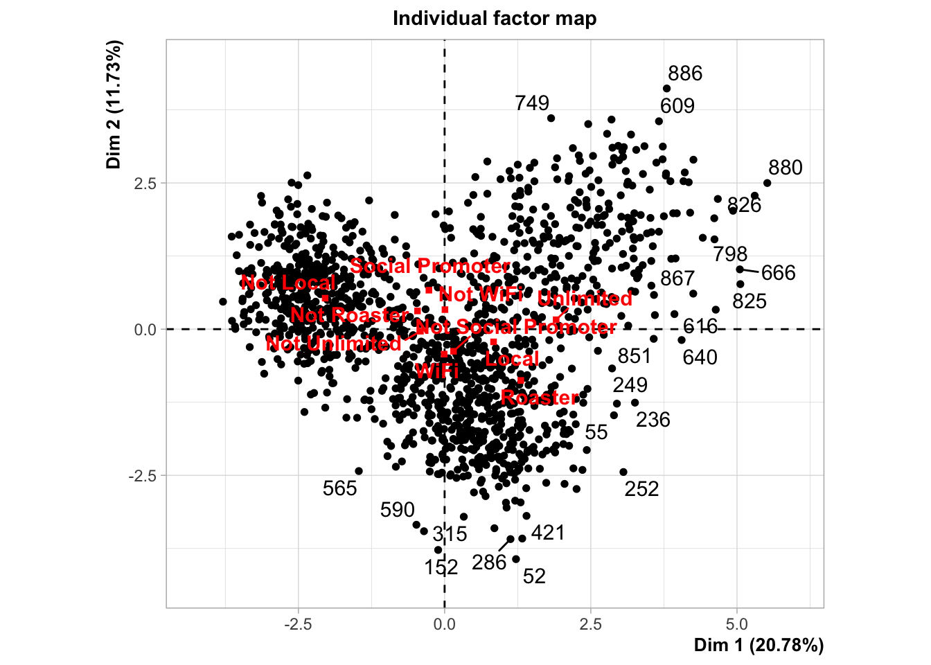
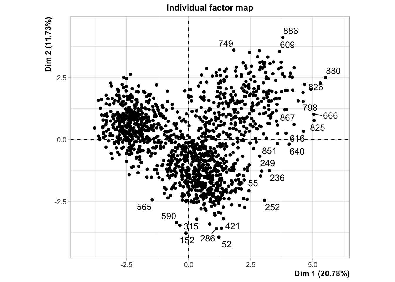
The solution I’ve chosen is an algorithmic technique known as Factor Analysis for Mixed Data. This algorithm runs the numeric variables through PCA and the categorical variables through Multiple Correspondence Analysis (MCA), the categorical equivalent of PCA. It then takes the resulting numeric output and creates new factors (similar to components) that can be used for clustering and other analysis. The resulting plots are not quite as satisfying, but they provide several views of the data, the last looking very similar to PCA.
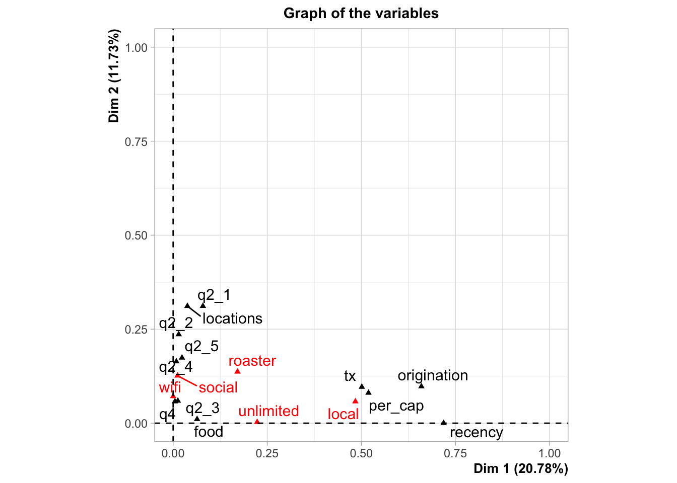
Don’t worry if you don’t follow all of the graphs above. They are just different views of the data after running the factoring algorithm. You might note the PCA plot at the bottom. It is only plotting the numeric variables. We can see that the directions are very similar to the PCA plot I previously constructed with the binary variables treated as numeric, the only difference is that the categorical variables have been removed.
3. Clustering with K-Means
I chose to begin my analysis with k-means. I am going to feed the k-means function in my stats software with the first two factor scores that resulted from my famd (Factor Analysis of Mixed Data). This will cost us some precision, but will make analysis easier.
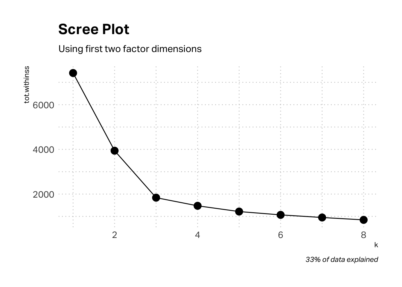
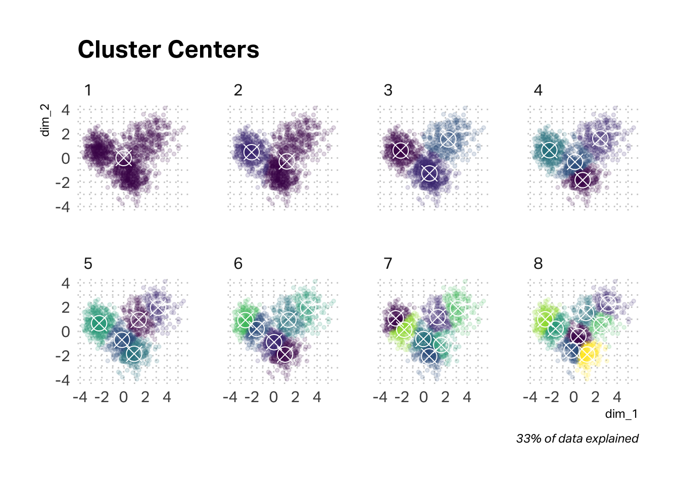
The scree plot below suggests an elbow of three clusters, but I’m interested in corroborating (or not) the qualitative research findings. A four-cluster solution seems viable.
The argument in favor of a three-cluster solution grows stronger when we map the cluster centers and tag the data points assigned to them. However, a four-cluster solution is not unwieldy. For discussion purposes, I’m going to stay with a four-cluster solution, but you may have chosen three clusters. It will be interesting to compare and contrast our results.
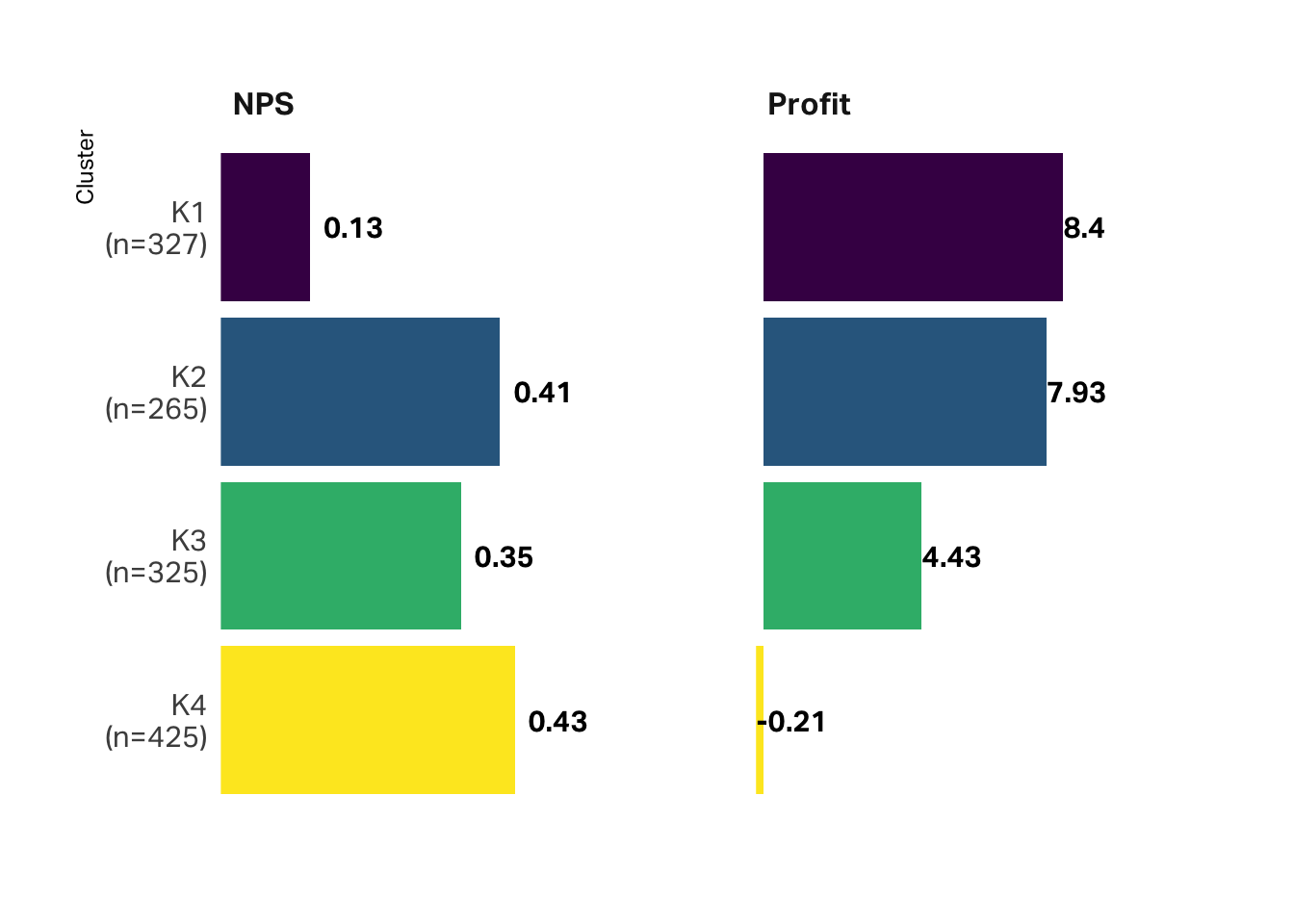
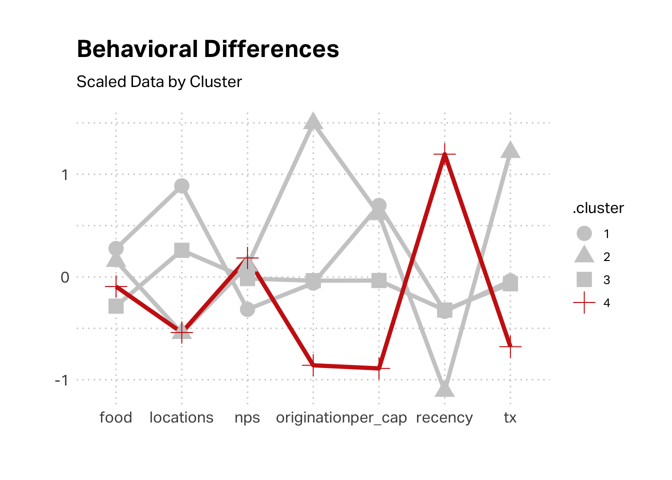
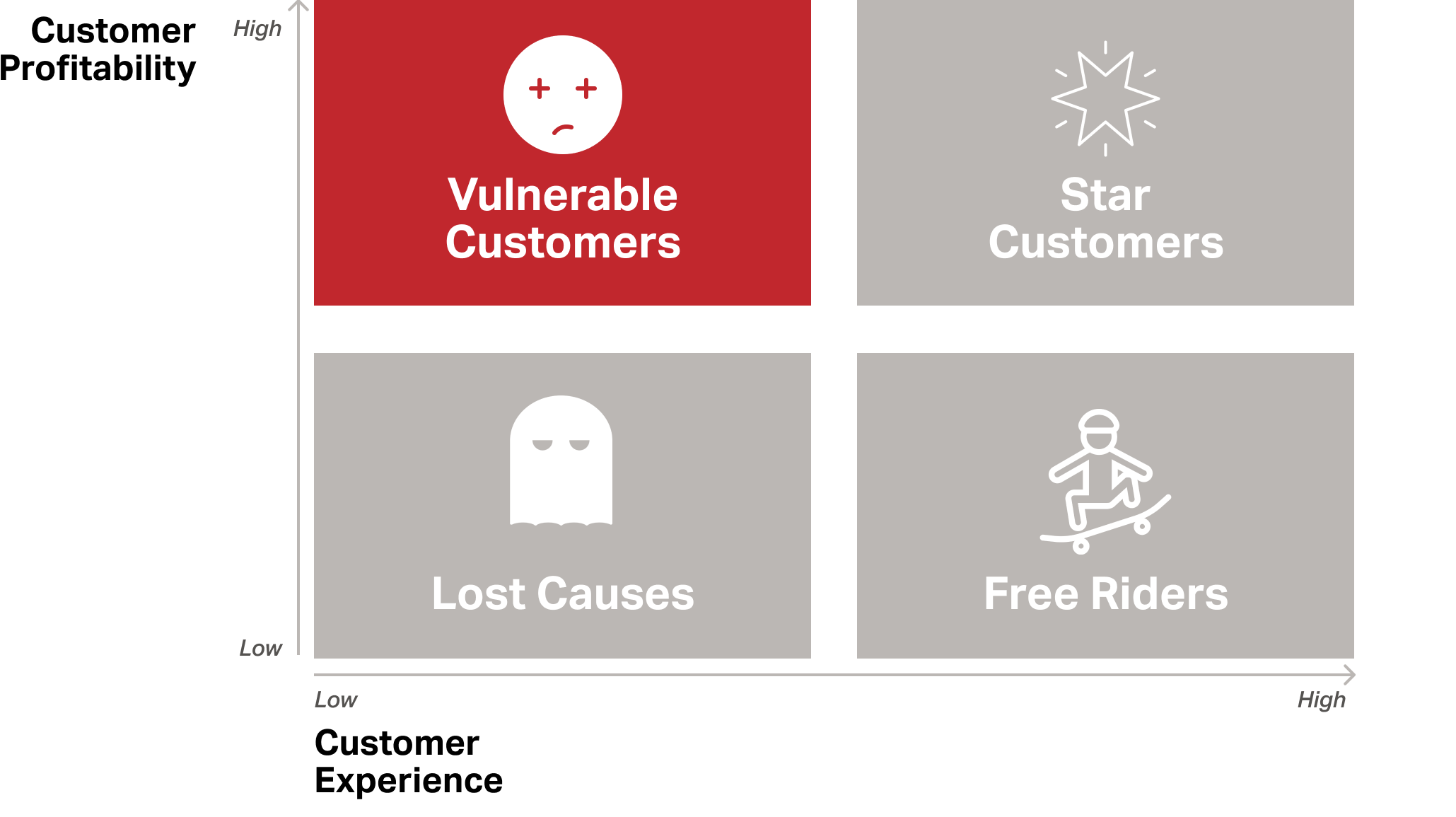
Once all the data has been assigned to a cluster, I find it helpful to consider the big picture. In this case, how does profitability and satisfaction differ by cluster? The graph below suggests that K4 is the most satisfied but the least profitable. K1 is the most profitable but the least satisfied.
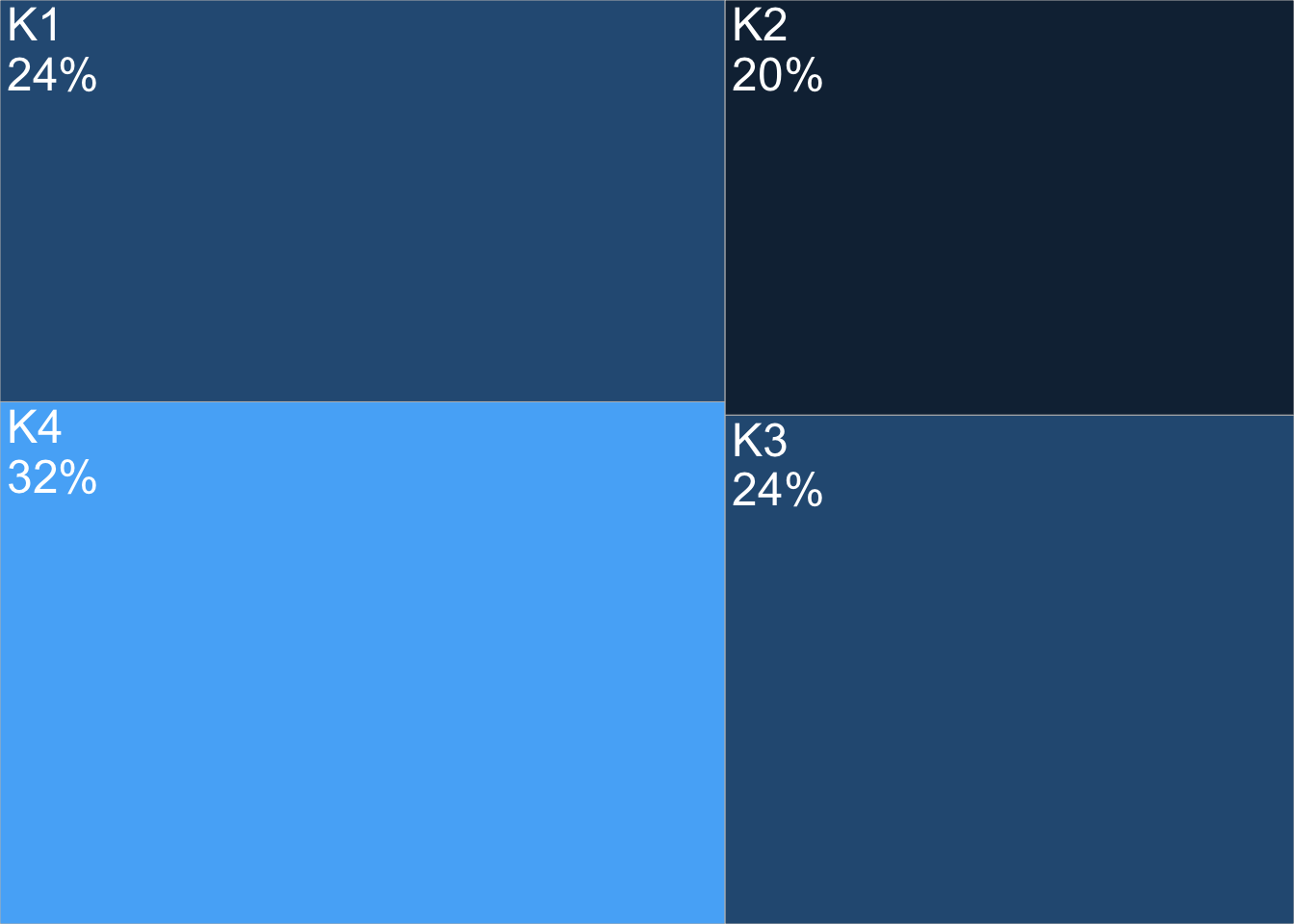
It’s also a good practice to consider scale and how substantial each of these segments is. Our least profitable segment (according to this segmentation) is also our biggest share of customers at 32%.
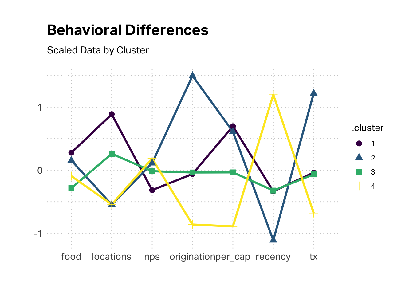
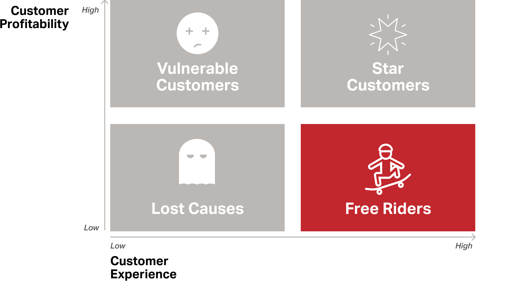
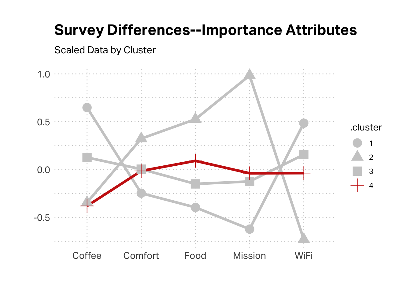
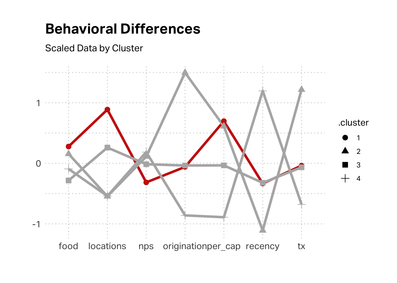
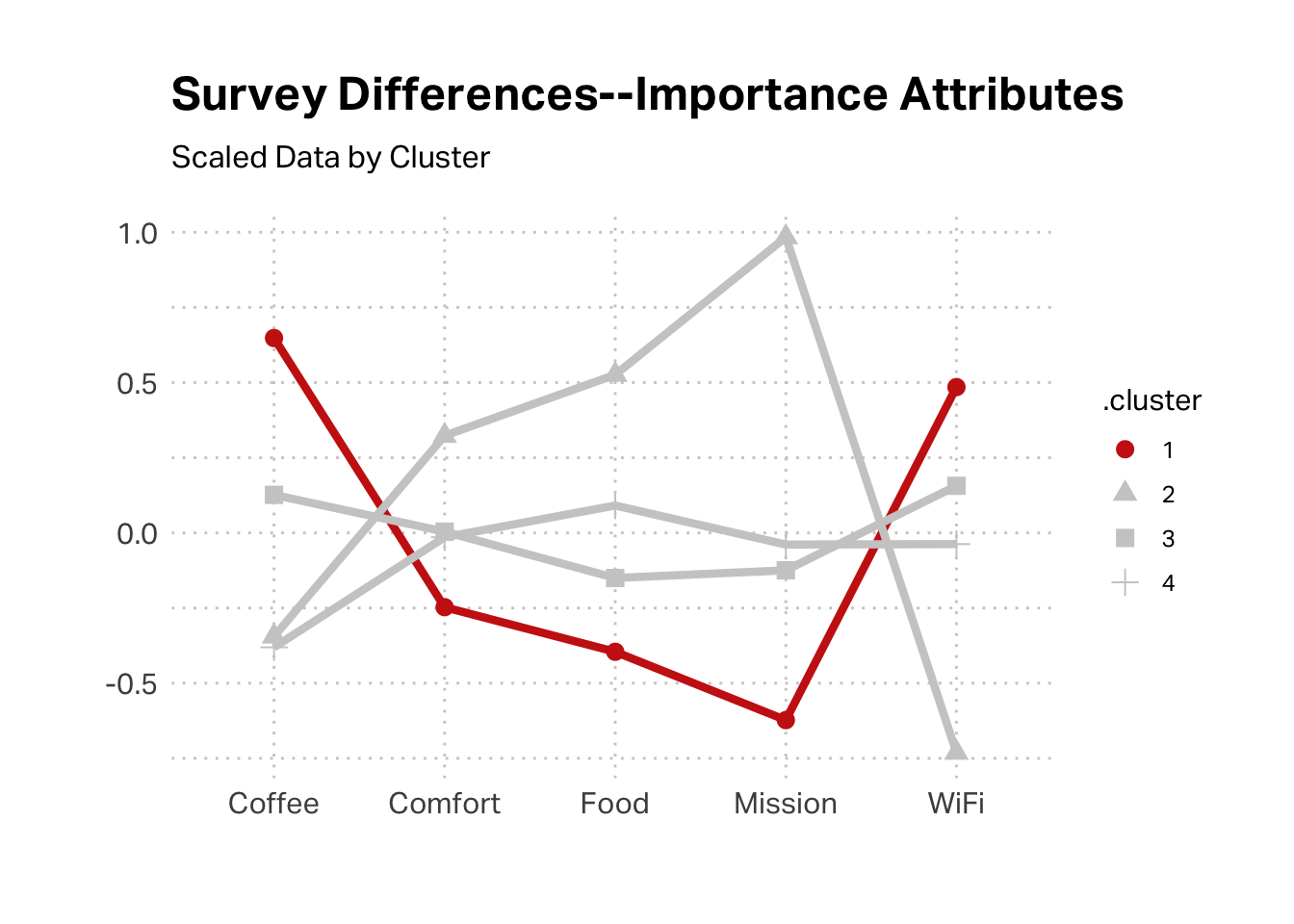
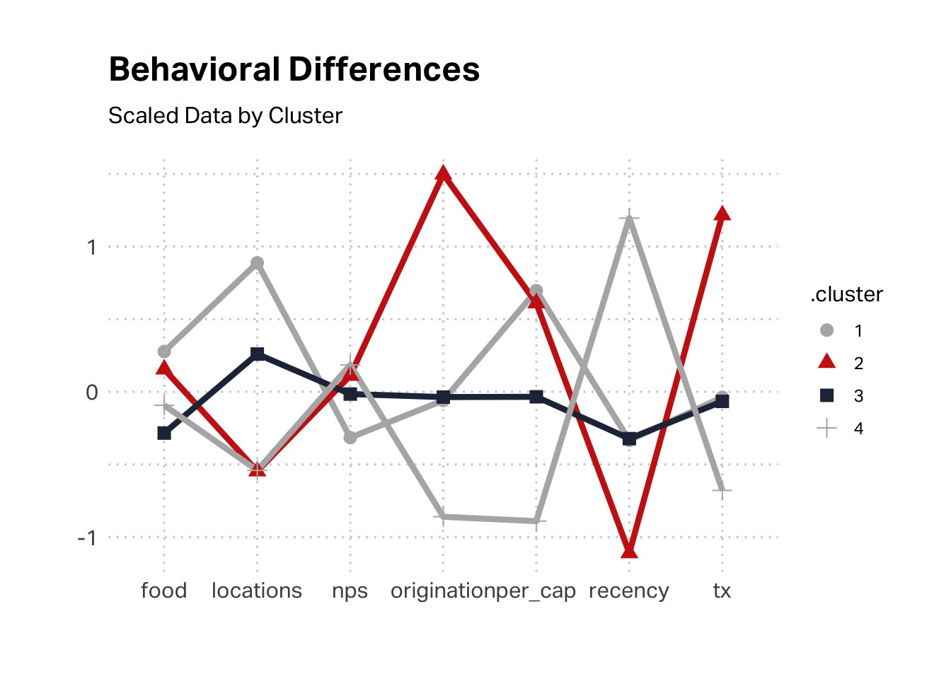
Let’s take a closer look at K4, since it is both substantial and economically challenging, relative to other customer segments. As we discussed in class, this is the classic “Free Rider” case, where we’re delivering a lot of value for this segment but they are not reciprocating. This segment transacted recently, was originated recently, had a low transaction value, and has visited very few locations (often only one). This seems to fit the profile of the Reese segment in Brad Dahlstrom’s qualitative study; it fits the profile of our tourist segment.
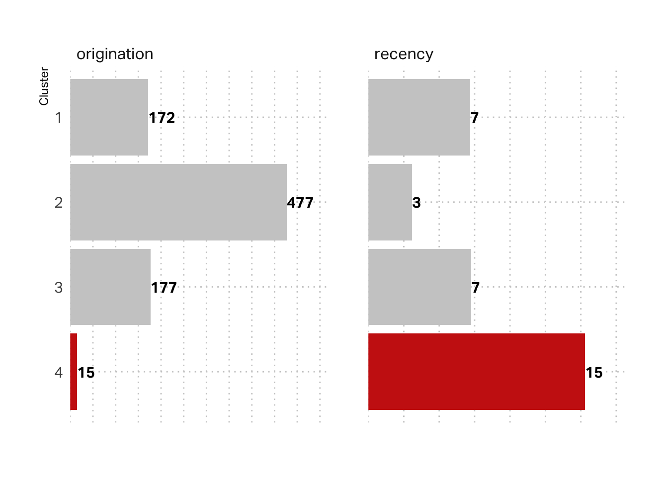
The above plot is mean scores of scaled data. We might glean more insight by looking at the raw data. In these terms, we can see that this segment indeed reflects a tourist visitation pattern. The average customer in this segment originated around 15 days ago and their last visit was also about 15 days ago.
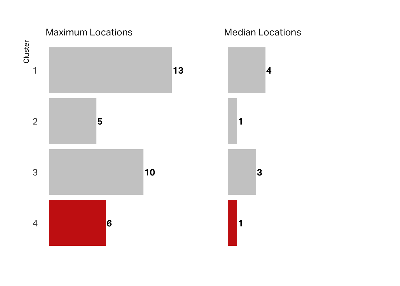
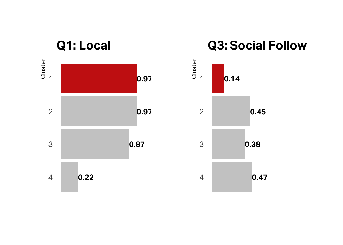
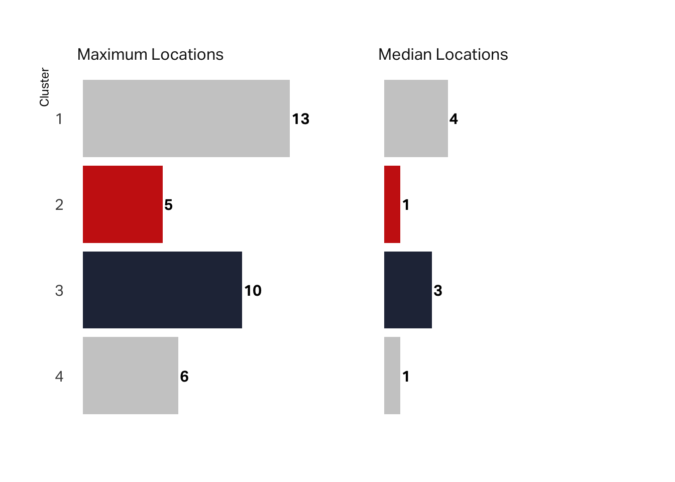
We can also look at the maximum number of locations visited vs the median number. While the maximum is not the lowest value, the median is. Most of these customers visited only one location. Again, this supports a hypothesis that this segment is the tourist (“Reese”) segment.
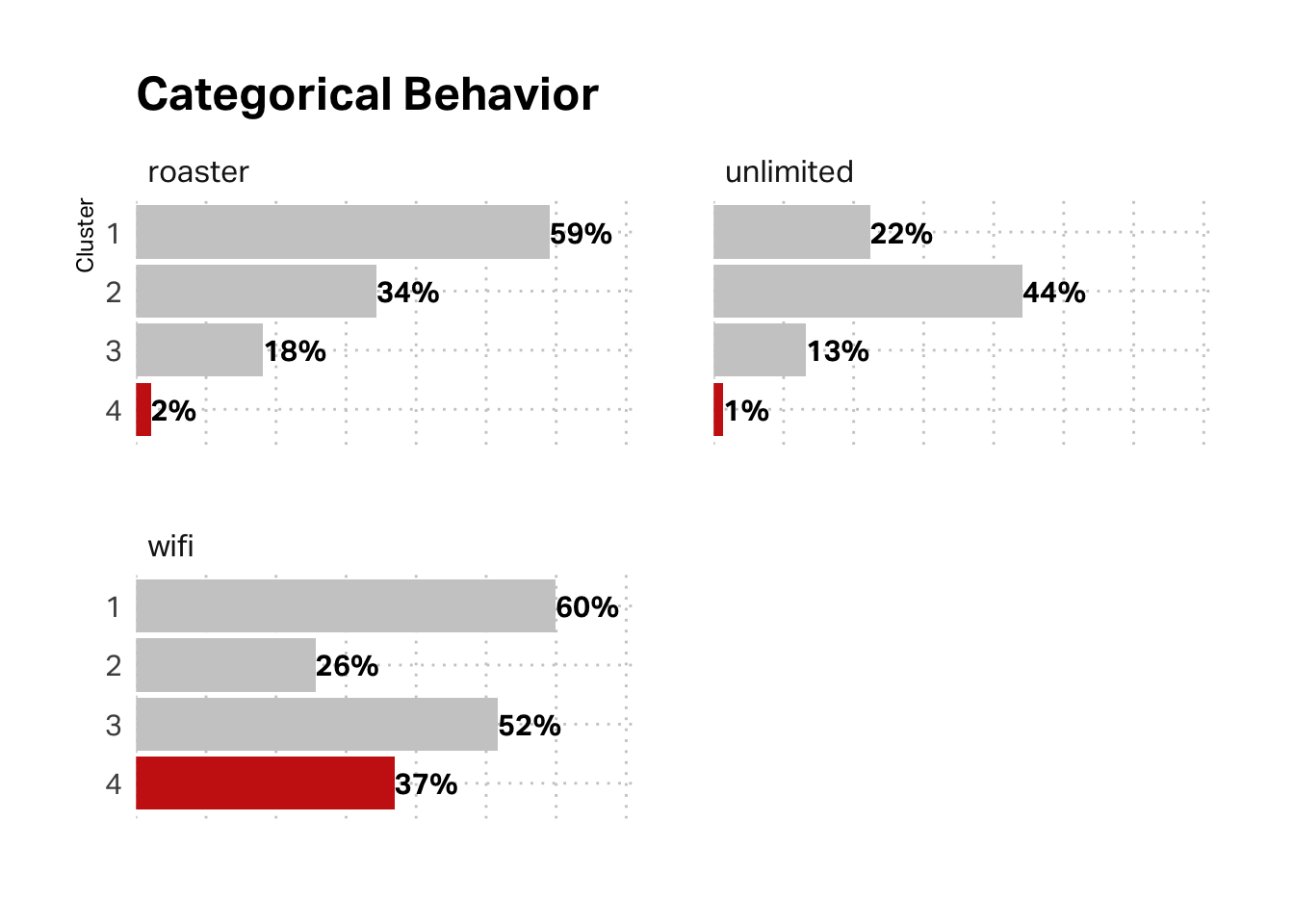
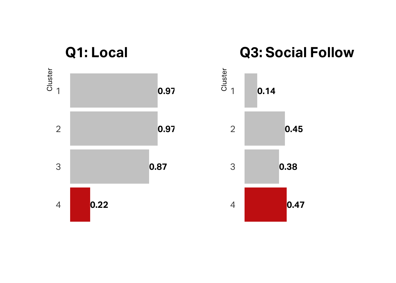
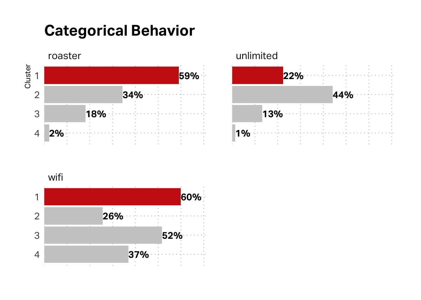
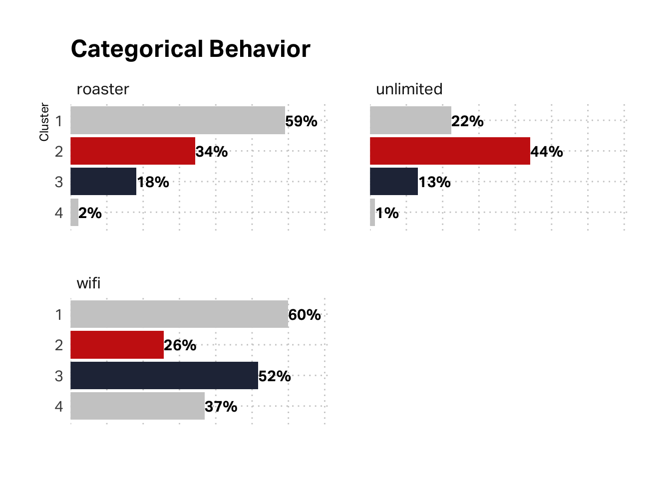
What about the categorical variables in our behavioral data (unlimited membership, roaster’s membership, and WiFi registration)? Here again, the data corroborates the hypothesis. This segment has the lowest membership in our loyalty programs and low registration for WiFi service.
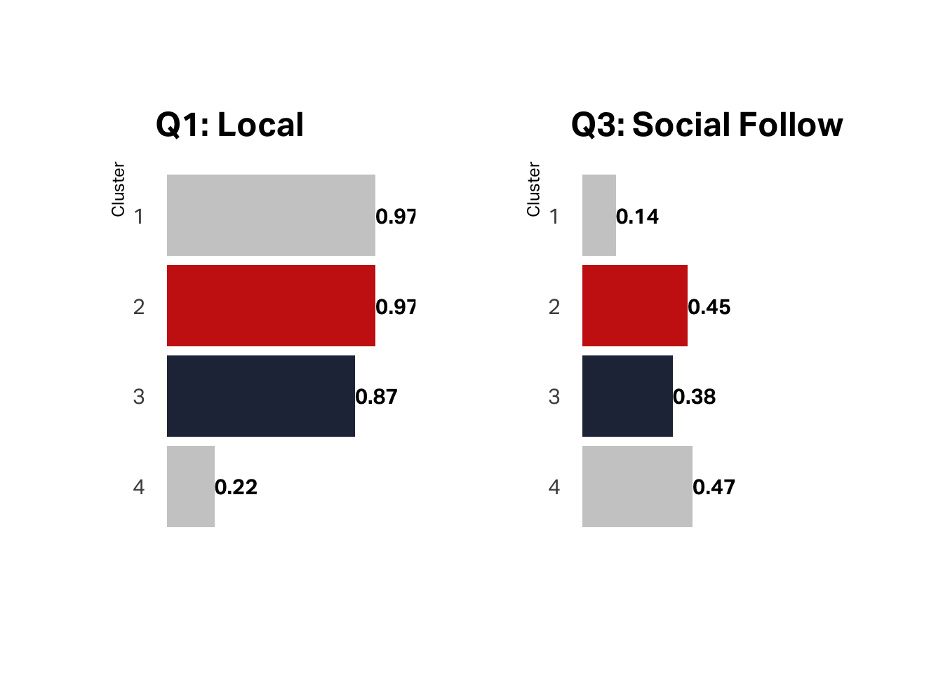
Despite the fact that less than a quarter of this segment claims they are local, almost half follow us on social media, which suggests this is our tourist segment.
Now, let’s look at the reverse: our customers who make the most profit but have the lowest satisfaction. The data here seems less clear. We would expect Brooke to have the highest number of locations, but we wouldn’t expect her to over-index Grady on Roaster’s Club.
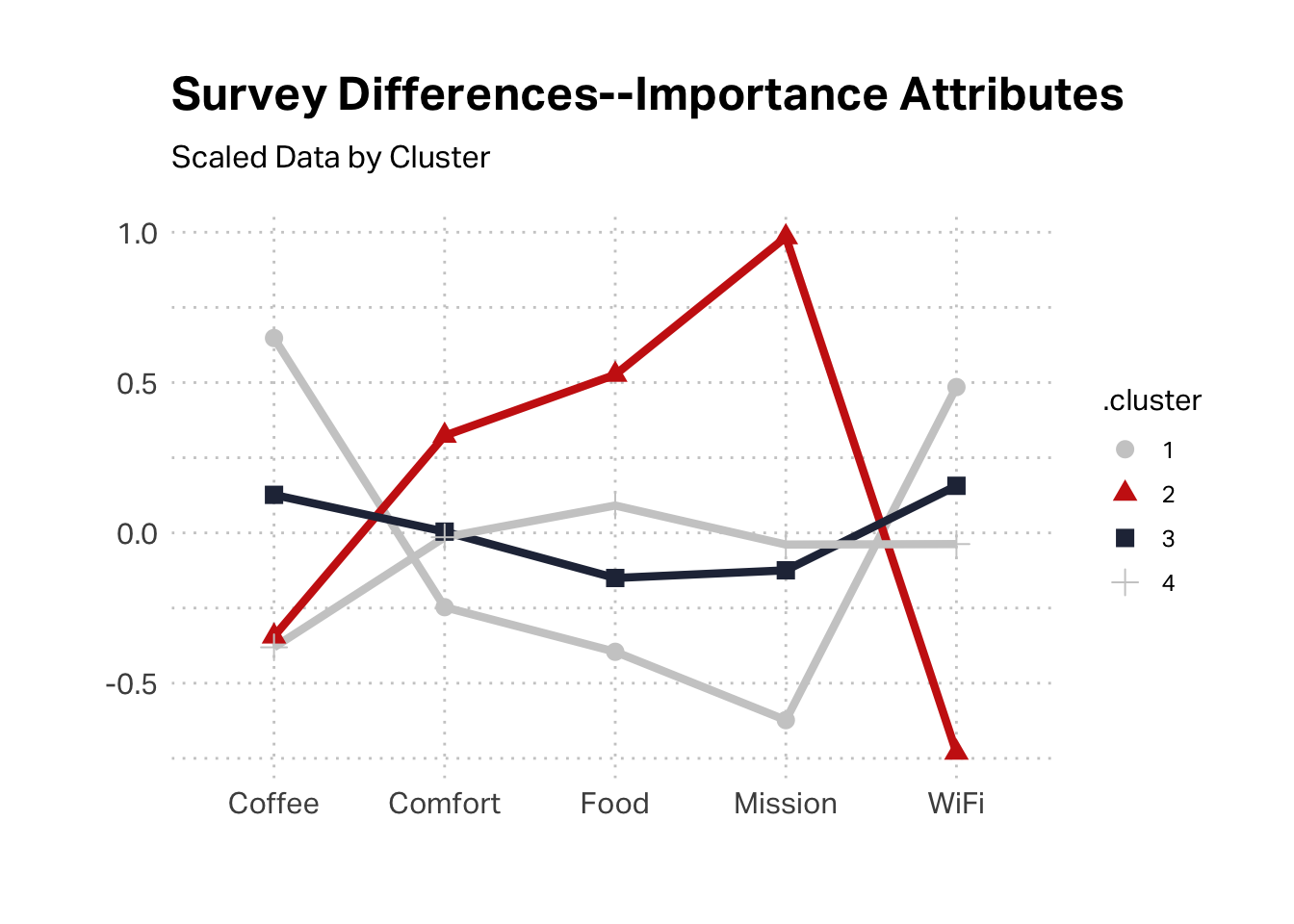
The survey data suggests that this might be Grady’s cohort. This cluster had the highest scores agreeing statement that “The quality of Hecuba’s coffee” is important.
Now, let’s consider K2 and K3. Each of these segments has decent satisfaction and profitability, with K3 slightly under-indexing on the latter dimension. The high origination for K3 suggests the segment identified as Michelle, though it is puzzling that this segment under-indexes on recency. High origination for K2 suggests Michelle.
Categorically, segment 2 is more likely to be enrolled in unlimited, which tracks with qualitative research on the Michelle segment–our loyalists. wifi is higher with segment 3, which tracks with Brooke.
The survey data would support an argument of segment 2 being aligned with Michelle, as the mission is the most important aspect, whereas segment 3 seems to have few high inflection points.