Code
# Test two candidate solutions
efa_2 <- fa(df_items, nfactors = 2, fm = "ml", rotate = "oblimin")
efa_3 <- fa(df_items, nfactors = 3, fm = "ml", rotate = "oblimin")
Teaching Note
In a previous note on latent variables, we established that psychological constructs (i.e., brand perception, trust, loyalty, satisfaction) often cannot be measured with a single question. Instead, it is common practice to triangulate through multiple survey questions, each capturing a slightly different facet of the same underlying thing. The purpose of this note is to help you understand how to analyze this data and confirm the presence of a latent variable (or factor) structure.
The two tools you need are Exploratory Factor Analysis (EFA) and Cronbach’s alpha. EFA helps you discover whether your survey items group into coherent dimensions. Cronbach’s alpha tells you whether the items within each dimension are reliably measuring the same thing. Together, they let you move from a battery of individual questions to a small set of validated composite scores, simplifying your analysis and its interpretation.
A word of caution before we begin. EFA is an exploratory step in the truest sense. As its name suggests, it exists to help you explore the data. Interpretive responsibility rests squarely on your shoulders. The algorithm will find groupings. Whether those groupings make theoretical and business sense is something only you can judge.
The data accompanying this note (fitness-brand-equity.csv) contains 500 survey responses from members of five competing boutique fitness brands—100 respondents per brand. For each respondent, nine brand attribute ratings are recorded on an 11-point scale (0–10).
| Variable | Survey Item |
|---|---|
coaching |
How would you rate the quality of coaching at [BRAND]? |
results |
How effective is [BRAND] at helping you achieve results? |
expertise |
How much expertise do the instructors at [BRAND] demonstrate? |
recommend |
How likely are you to recommend [BRAND] to others? |
community |
How strong is the sense of community at [BRAND]? |
energy |
How would you rate the energy at [BRAND]? |
atmosphere |
How motivating is the environment at [BRAND]? |
affordable |
How affordable is [BRAND]? |
worth_it |
How much value does [BRAND] deliver for the price? |
The question we’re asking: do these nine items measure nine distinct things, or do some of them cluster into a smaller number of underlying dimensions?
The best analysts develop an intuition about their data before handing it to an algorithm. With factor analysis, that means looking for evidence of structure in the correlations between variables. Items that measure the same latent construct should correlate strongly with each other and more weakly with items measuring something else.
A correlation matrix is your first stop.
library(tidyverse)
library(here)
library(scales)
library(hrbrthemes)
library(psych)
library(corrplot)
library(ggrepel)
library(broom)

theme_set(theme_ipsum(base_family = "Aktiv Grotesk"))

source(here("src/new-palette.R"))

df <- read_csv(here("data/clean/fitness-brand-equity.csv"))

ITEMS <- c("coaching", "results", "expertise", "recommend",
           "community", "energy", "atmosphere", "affordable", "worth_it")

df_items <- df |> select(all_of(ITEMS))

cor_matrix <- cor(df_items, use = "pairwise.complete.obs")

corrplot(cor_matrix,
         method      = "color",
         type        = "upper",
         order       = "hclust",   # clusters correlated variables together
         tl.col      = "black",
         tl.srt      = 45,
         addCoef.col = "black",
         number.cex  = 0.9,
         col = colorRampPalette(c("#2166ac", "white", "#b2182b"))(200),
         title = "Correlation Matrix: Brand Attribute Items",
         mar = c(0, 0, 2, 0))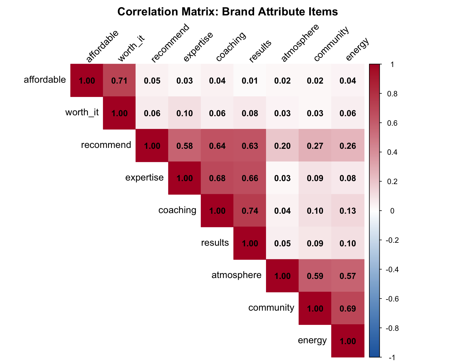
Look for blocks of high correlation (dark red). In this plot, we grouped higher correlation items closer to each other, to make interpretation easier. If you see two or three distinct blocks, you’re likely looking at two or three underlying factors.
A PCA plot is another way to view of the same information. Each arrow represents one variable; variables whose arrows point in similar directions are correlated with each other and likely belong to the same factor.
pca_result <- prcomp(df_items, scale. = TRUE)

pca_tidy <- pca_result |>
  tidy(matrix = "rotation") |>
  pivot_wider(names_from = PC, names_prefix = "PC", values_from = value)

pca_tidy |>
  ggplot(aes(x = PC1, y = PC2)) +
  geom_segment(
    xend = 0, yend = 0,
    arrow = arrow(ends = "first", length = unit(6, "pt"))
  ) +
  geom_label_repel(aes(label = column), size = 4) +
  geom_hline(yintercept = 0, linetype = "dashed", color = "gray50") +
  geom_vline(xintercept = 0, linetype = "dashed", color = "gray50") +
  labs(
    title = "PCA Plot of Brand Attribute Items",
    subtitle = "Variables pointing in similar directions share variance",
    x = "Principal Component 1",
    y = "Principal Component 2"
  )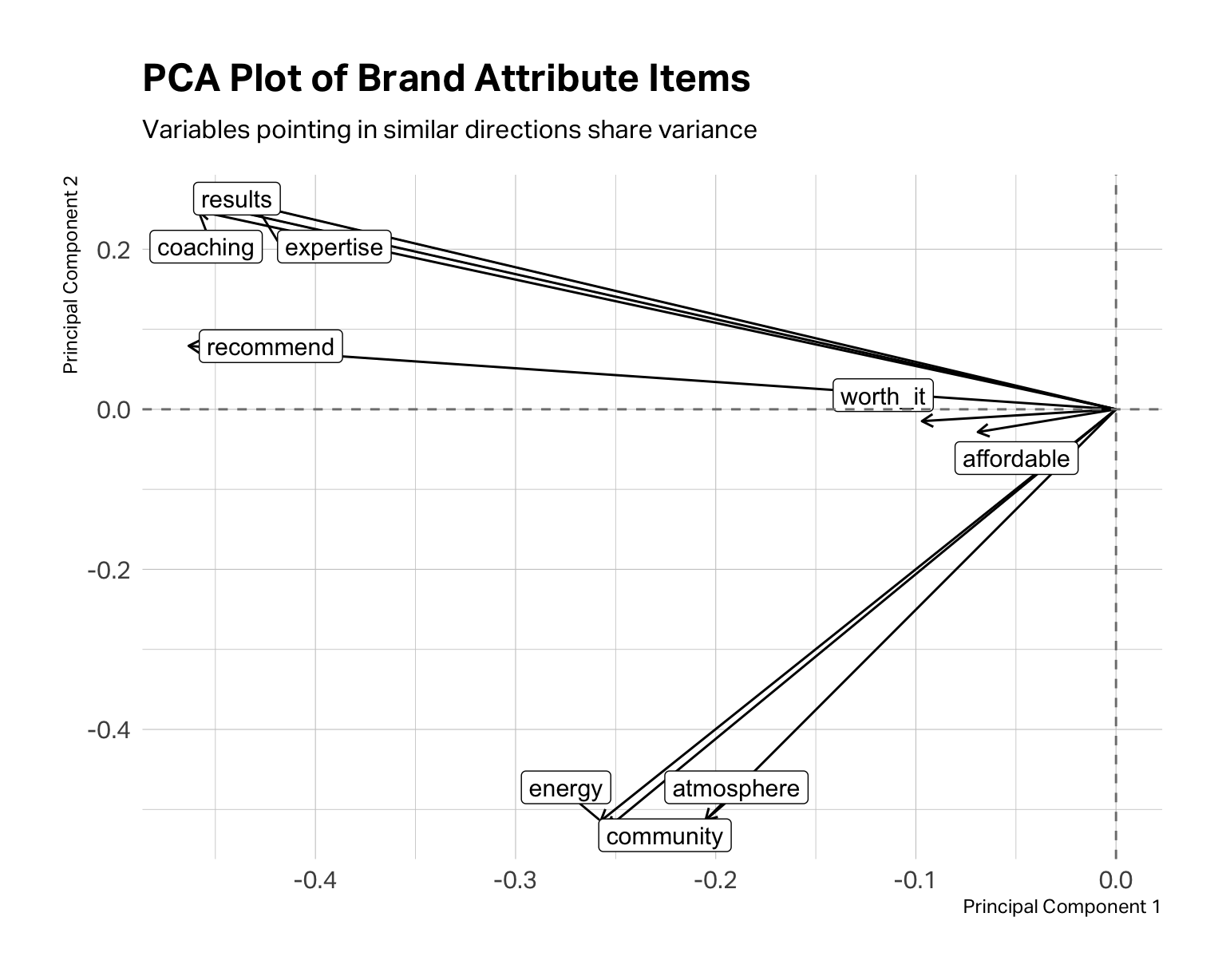
In the fitness data, coaching, results, expertise, and recommend tend to “travel together,” suggesting a performance or coaching dimension. community, energy, and atmosphere point in a different direction, suggesting an experience or vibe cluster. affordable and worth_it form their own grouping around price perception. At this point, these are merely hypotheses. The PCA plot tells you where to look; EFA tells you what might actually be there.
EFA requires you to determine the number of factors. The above analyses allow you to consider your options and form hypotheses. A scree plot is yet another way to work your hypothesis about how many factors to extract.
# Scree plot — eigenvalues from a single fa() call
fa_model <- fa(df_items, nfactors = 1, fm = "ml")

fa_model$values |>
  enframe(name = "factor", value = "eigenvalue") |>
  ggplot(aes(x = factor, y = eigenvalue)) +
  geom_line(linewidth = 1, color = "#C0292D") +
  geom_point(size = 3, color = "#C0292D") +
  geom_hline(yintercept = 1, linetype = "dashed", color = "gray50") +
  scale_x_continuous(breaks = 1:9) +
  labs(
    title    = "Scree Plot",
    subtitle = "Dashed line marks eigenvalue = 1 (Kaiser criterion)",
    x        = "Factor Number",
    y        = "Eigenvalue"
  ) +
  theme(
    plot.title.position = "plot",
    plot.margin = margin(0, 0, 0, 0)
    )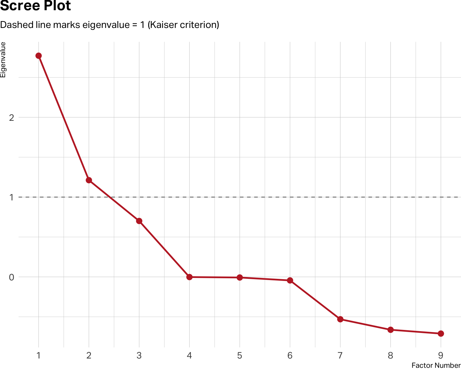
The y-axis shows eigenvalues, which are a measure of how much variance each factor accounts for. In theory, you retain factors where your observed values sit clearly above the baseline of 1. Diminishing returns typically begin below the baseline.
Don’t treat the scree plot as a verdict. It isn’t. It’s a range of estimates, not a definitive answer. The scree plot above suggests a two-factor solution may be optimal. But a three-factor solution may be cleaner, more logical and interpretable for your specific research question. Within the range it suggests, you must apply marketing judgment.
Run the solutions that seem plausible. Compare them. Ask yourself: which structure would a brand manager find actionable? Which labels feel meaningful rather than arbitrary? The right number of factors is the one that is both statistically supportable and theoretically coherent.
With a working hypothesis in hand, you run the EFA. No matter which software you use, you will need to specify how many factors to extract, and you may have to specify the type of estimation (usually maximum likelihood), as well as how much correlation between factors is preferred. Most packages default to an orthogonal rotation. This rotation will estimate factors that have minimal to no correlation between factors. You can also specify oblique rotations, which allow factors to be correlated. Often in marketing, correlation between factors is expected.
For example, in a brand equity study, coaching quality and community experience might reasonably be treated as separate dimensions. One is about what happens in the room, the other is about who you’re in the room with. But in practice, studios that excel on one tend to attract members who drive the other higher as well. Forcing these factors to be orthogonal when they’re naturally correlated can distort the loadings and misrepresent the actual structure of the data. For that reason, we prefer an oblique rotation for most marketing applications — and we recommend you default to one unless you have a specific theoretical reason to assume your factors are independent.
The output you care about is the factor loadings table: a matrix showing how strongly each item correlates with each factor. In the loadings tables for a two-factor and three-factor model below, we’ve set thresholds to only show loadings greater than 0.3 so you can see the structure more clearly. Items with loadings above 0.50 on a factor are strong indicators of that factor. Items that load substantially on two factors simultaneously are called cross-loadings and may need to be dropped from the model or reconsidered.
# Test two candidate solutions
efa_2 <- fa(df_items, nfactors = 2, fm = "ml", rotate = "oblimin")
efa_3 <- fa(df_items, nfactors = 3, fm = "ml", rotate = "oblimin")
Two-Factor Model
print(efa_2$loadings, cutoff = 0.3)
Loadings:
           ML1    ML2
coaching    0.876
results     0.859
expertise   0.787
recommend   0.715
community          0.849
energy             0.813
atmosphere         0.707
affordable
worth_it

                 ML1   ML2
SS loadings    2.646 1.924
Proportion Var 0.294 0.214
Cumulative Var 0.294 0.508
Three-Factor Model
print(efa_3$loadings, cutoff = 0.3)
Loadings:
           ML2    ML3    ML1
coaching    0.877
results     0.859
expertise   0.785
recommend   0.715
community          0.850
energy             0.812
atmosphere         0.706
affordable                0.714
worth_it                  0.997

                 ML2   ML3   ML1
SS loadings    2.637 1.921 1.506
Proportion Var 0.293 0.213 0.167
Cumulative Var 0.293 0.507 0.674
A three-factor model seems optimal. It has clean and strong loadings with, no significant cross-loadings. Also, it explains about 67% of the variance in the model, whereas the two-factor model explains about 51%.
In practice, you’ll rarely see something this tidy on the first pass. These loadings are extremely strong because this is a simulated dataset.
When presenting factor structures to an audience, a color-encoded table often communicates more intuitively than a matrix of numbers.
loadings_df <- efa_3$loadings |>
  unclass() |>
  as_tibble(rownames = "item") |>
  rename(Value = ML1, Performance = ML2, Experience = ML3) |>
  pivot_longer(-item, names_to = "factor", values_to = "loading")

loadings_df |>
  ggplot(aes(x = factor, y = fct_rev(item), fill = loading)) +
  geom_tile(color = "white") +
  geom_text(aes(label = round(loading, 2)), size = 4.5) +
  scale_fill_gradient2(
    low = "#2166ac", mid = "white", high = "#b2182b",
    midpoint = 0, limits = c(-1, 1),
    name = "Loading"
  ) +
  labs(
    title = "Factor Loadings Heat Map",
    subtitle = "Three-factor EFA solution",
    x = "", y = ""
  ) +
  theme(
    axis.text.y = element_text(size = 11),
    plot.margin = margin(0, 0, 0, 0),
    plot.title.position = "plot"
    )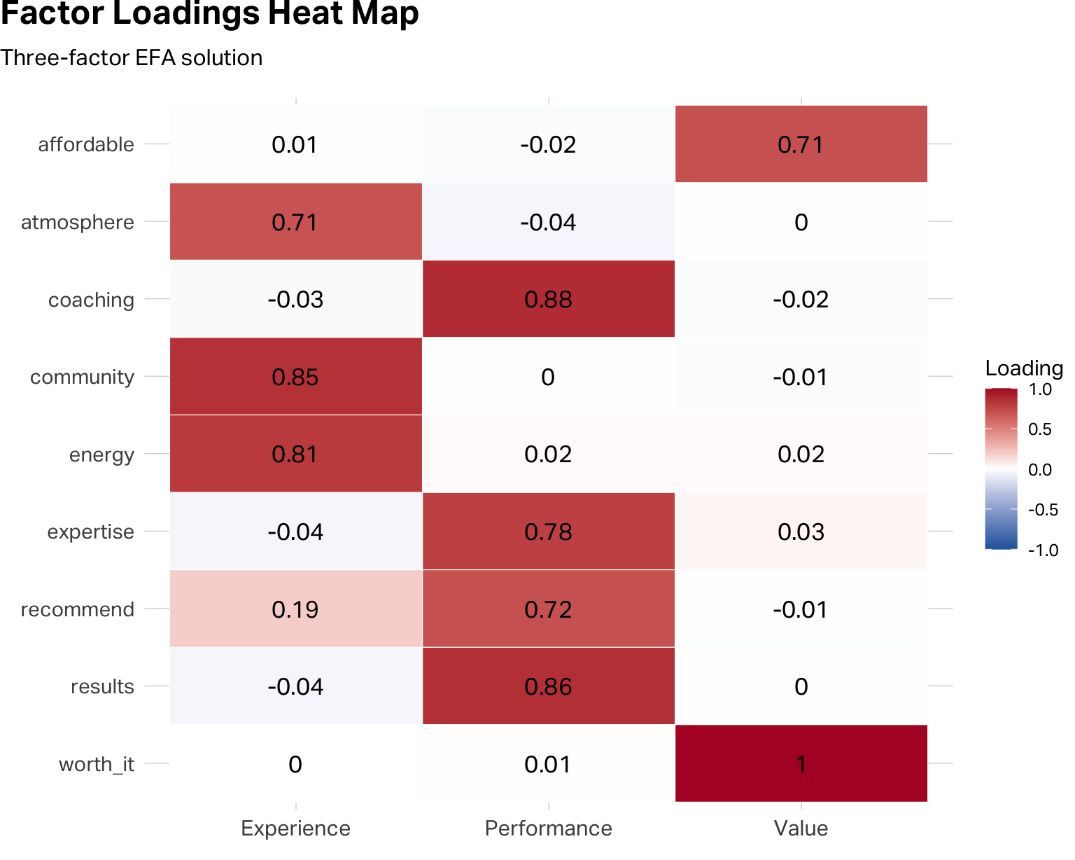
The heat map and the table communicate the same information. The heat map does it faster for an audience; the table is better for your own analytical work.
Stopping here is the mistake that derails many student projects. They run EFA, see strong loadings that look reasonably clean and they decide to proceed by merging the data into the smaller factor structure.
The factor loadings tell you that items tend to move together. You need to be statistically confident that a factor structure exists that is reliable enough for you to transform your data. Cronbach’s alpha is a measure of internal reliability that does this task for you.
Cronbach’s alpha (often simply referred to as “alpha reliability”) asks a harder question. Are the items within each factor reliably measuring the same underlying construct? The alpha coefficient (α) ranges from 0 to 1. As a rule of thumb, α ≥ 0.70 is the minimum threshold for applied research. Values above 0.80 indicate solid reliability. Values above 0.90 are excellent, though they occasionally signal that your items may be too perfect—asking the same thing in near-identical ways rather than triangulating a construct from multiple angles.
You run the alpha estimation on each factor variable you would like to create. Let’s begin with the Performance factor.
performance_items <- c("coaching", "results", "expertise", "recommend")
alpha_perf <- alpha(df_items[, performance_items])
print(alpha_perf, digits = 3)
Reliability analysis
Call: alpha(x = df_items[, performance_items])

  raw_alpha std.alpha G6(smc) average_r  S/N     ase mean   sd median_r
     0.885     0.884   0.855     0.657 7.65 0.00838 5.24 1.93    0.652

    95% confidence boundaries
         lower alpha upper
Feldt    0.867 0.885 0.900
Duhachek 0.868 0.885 0.901

 Reliability if an item is dropped:
          raw_alpha std.alpha G6(smc) average_r  S/N alpha se   var.r med.r
coaching      0.832     0.833   0.771     0.624 4.97  0.01288 0.00196 0.634
results       0.838     0.838   0.780     0.633 5.18  0.01250 0.00300 0.641
expertise     0.861     0.861   0.810     0.673 6.18  0.01073 0.00372 0.641
recommend     0.873     0.873   0.824     0.696 6.88  0.00986 0.00178 0.684

 Item statistics
            n raw.r std.r r.cor r.drop mean   sd
coaching  500 0.891 0.890 0.851  0.798 5.28 2.24
results   500 0.887 0.882 0.835  0.783 5.19 2.36
expertise 500 0.848 0.847 0.770  0.725 5.13 2.23
recommend 500 0.821 0.827 0.732  0.691 5.38 2.12
Your first stop is to assess the raw alpha score for this factor. A score of 0.88 is good and strong. But that’s not the end of your analysis. You need to pay particular attention to the alpha drops (here shown in the table under Reliability if an item is dropped).
This table tells you how much the raw alpha score would change if you removed this item from your factor structure. If the result for any item is larger than your raw alpha score, you should consider removing the item from the structure, as the overall factor reliability would improve. Similarly, if the drop score for an item is less than the raw alpha, then you know that the item is contributing to the factor’s reliability score.
Experience Factor Reliability
experience_items  <- c("community", "energy", "atmosphere")
alpha_exp  <- alpha(df_items[, experience_items])
print(alpha_exp,  digits = 3)
Reliability analysis
Call: alpha(x = df_items[, experience_items])

  raw_alpha std.alpha G6(smc) average_r  S/N    ase mean   sd median_r
      0.83      0.83   0.771     0.619 4.88 0.0131 5.44 1.95    0.591

    95% confidence boundaries
         lower alpha upper
Feldt    0.803  0.83 0.855
Duhachek 0.805  0.83 0.856

 Reliability if an item is dropped:
           raw_alpha std.alpha G6(smc) average_r  S/N alpha se var.r med.r
community      0.727     0.729   0.573     0.573 2.68   0.0243    NA 0.573
energy         0.742     0.743   0.591     0.591 2.90   0.0230    NA 0.591
atmosphere     0.819     0.819   0.694     0.694 4.54   0.0162    NA 0.694

 Item statistics
             n raw.r std.r r.cor r.drop mean   sd
community  500 0.885 0.882 0.801  0.727 5.55 2.29
energy     500 0.880 0.875 0.786  0.712 5.42 2.33
atmosphere 500 0.826 0.835 0.688  0.633 5.36 2.13
Value Factor Reliability
value_items       <- c("affordable", "worth_it")
alpha_val  <- alpha(df_items[, value_items])
print(alpha_val,  digits = 3)
Reliability analysis
Call: alpha(x = df_items[, value_items])

  raw_alpha std.alpha G6(smc) average_r  S/N    ase mean   sd median_r
     0.831     0.831   0.711     0.711 4.92 0.0151 5.14 2.17    0.711

    95% confidence boundaries
         lower alpha upper
Feldt    0.798 0.831 0.858
Duhachek 0.801 0.831 0.860

 Reliability if an item is dropped:
           raw_alpha std.alpha G6(smc) average_r  S/N alpha se var.r med.r
affordable     0.739     0.711   0.506     0.711 2.46       NA     0 0.711
worth_it       0.684     0.711   0.506     0.711 2.46       NA     0 0.711

 Item statistics
             n raw.r std.r r.cor r.drop mean   sd
affordable 500 0.928 0.925  0.78  0.711 5.10 2.39
worth_it   500 0.922 0.925  0.78  0.711 5.18 2.30
In this case, all three factors have good reliability and their structures would not meaningfully improve by removing an item.
Once you’re satisfied that each factor is theoretically coherent and its items pass the reliability test, you create composite scale scores by taking the mean of the constituent items for each respondent.
df <- df |>
  mutate(
    Performance = rowMeans(across(all_of(performance_items)), na.rm = TRUE),
    Experience  = rowMeans(across(all_of(experience_items)),  na.rm = TRUE),
    Value    = rowMeans(across(all_of(value_items)),       na.rm = TRUE)
  )

df |>
  select(Brand = brand, Performance:Value) |>
  pivot_longer(
    !Brand,
    names_to = "Factor",
    values_to = "Score"
  ) |>
  group_by(Brand, Factor) |>
  summarise(
    mu = mean(Score)
  ) |>
  ungroup() |>
  group_by(Factor) |>
  mutate(
    min = min(mu),
    max = max(mu)
  ) |>
  ggplot(aes(y=fct_rev(Factor), x=mu, shape=Brand, color=Brand)) +
  geom_segment(aes(x = min, xend = max),
               color = "#CDCDCD") +
  geom_point(size = 4.5) +
  scale_color_manual(values = conclusive_categorical_8[2:6]) +
  theme(
    plot.margin = margin(0, 0, 0, 0),
    plot.title.position = "plot",
    legend.position = "top",
    legend.justification = "left",
    legend.location = "plot"
  ) +
  labs(
    title = "Mean Factor Scores by Brand",
    x=NULL,
    y=NULL
  )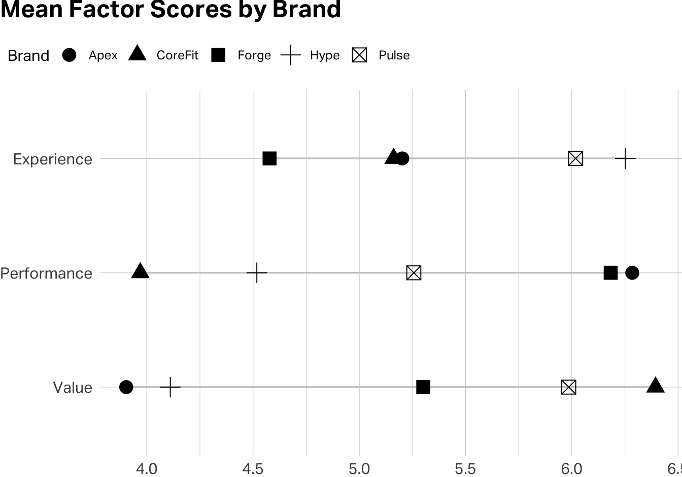
You’ve just reduced nine variables to three validated composite scores. These are now ready for downstream analysis—brand comparisons, regression, segmentation … all with the confidence that each one is measuring something coherent and doing so reliably.
EFA is not confirmatory. It explores structure in your specific dataset. A factor structure that emerges cleanly in one sample may not replicate in another. If you’re building a scale intended for ongoing use, you’ll eventually want to run Confirmatory Factor Analysis (CFA) on a fresh dataset to test whether the structure holds. EFA is the beginning of scale validation, not the end.
More factors is not more insight. There’s a temptation to extract as many factors as the scree plot allows, because more dimensions feels like a richer understanding. But a factor you can’t label (one whose items don’t cohere around a clear construct) might be noise. Always ask, “if I were briefing a brand manager on this factor, what would I call it, and would they find it actionable?”
Watch for reverse-coded items. If any of your items are phrased so that higher scores indicate something negative, you’ll need to reverse-code them before computing scale means. Otherwise, alpha will penalize the item for moving opposite to its scale partners.
Alpha measures internal consistency, not validity. A scale can have a high alpha and still be measuring the wrong thing. If your Performance scale items all correlate strongly with each other, that confirms they’re measuring something coherent but it does not necessarily mean that the construct is coaching quality rather than general brand favorability. Validity is ultimately a theoretical argument, not just a statistical one.
Hair, J. F., Black, W. C., Babin, B. J., & Anderson, R. E. (2019). Multivariate Data Analysis (8th ed.). Cengage. Chapters 3 and 4 provide a rigorous treatment of EFA and scale development that goes considerably deeper than this note.
Revelle, W. (2024). psych: Procedures for Psychological, Psychometric, and Personality Research. Northwestern University. The package documentation and vignettes are among the most practical guides to running EFA and reliability analysis in R. Available at https://CRAN.R-project.org/package=psych.
Note: AI can help you debug code and think through analytical tradeoffs, but the decision about what a factor means for your brand—and whether a scale is capturing something strategically useful—is yours to make. No algorithm knows your market.