
Show the Data. Make the Point.
Teaching Note
The View from the Other Side of the Table
You’re a vice president at a consumer goods company. You’ve been in back-to-back meetings since 8:30 this morning, you haven’t eaten lunch, and your inbox is staging a coup. Somewhere between now and 5pm, you need to decide whether to greenlight a $2 million product launch. A research team walks in. They’ve been working on a customer insights project for three weeks, and they have 15 minutes to tell you what they learned.
The first slide appears: “Overview of Statistical Methodology.”
And … your soul just left your body.
The presenter begins: “We conducted a mixed-methods study combining quantitative survey data with qualitative interviews. Our sample consisted of 847 respondents recruited through an online panel, stratified by age, gender, and geographic region to ensure representativeness…”
Five minutes in, you have no idea what they found. You don’t know what question they were trying to answer. You don’t know what decision you’re being asked to make. You’re checking your phone under the table, refreshing your inbox like something urgent might save you.
The research might be brilliant. The insights might be career-making. But none of that matters because the presenter has committed the cardinal sin of business communication—they’re narrating their odyssey through the data instead of telling you what they found.
This is Death by PowerPoint. It’s the meeting that could have been an email. It’s the reason executives have developed a Pavlovian reflex to look at their watch every time someone says “stratified sample.” And if you’re the one presenting, it means you’ve already lost—not because your research was bad, but because you’re giving them eight episodes of build-up when they needed the answer in the first 30 seconds.
This isn’t Squid Game. Nobody wants to survive six rounds to find out what you’re recommending. Lead with the headline.
Lead with the Answer
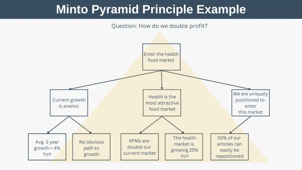
In the 1960s, Barbara Minto was working as a consultant at McKinsey & Company when she noticed something interesting: really smart people were really terrible at communicating their ideas. They would build to a conclusion by first presenting all the facts, recounting all the analyses, and reviewing all the supporting evidence. Then, finally, they would arrive at the punch line.
This is how we naturally think through problems. It is not how we should communicate them.
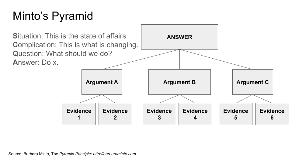
Minto developed what she called the Pyramid Principle, and it inverts the traditional approach. Instead of building up to your conclusion, you start with it. You tell your audience the answer first, then provide the key arguments that support it, then offer the detailed evidence underneath. The most important information sits at the top of the pyramid; the supporting details form the base.
Courtesy: Expert Program Management https://expertprogrammanagement.com/
The logic is simple: your audience is busy. They want to know what you’re recommending and why. If they’re convinced, they don’t need to wade through the details. If they’re skeptical, they can drill down into whatever concerns them. But they can’t do either if they don’t know where you’re headed.
This approach is sometimes called BLUF—“bottom line up front”—a term borrowed from military communication. Minto framed it as a four-part narrative structure: Situation, Complication, Question, Answer. You establish context (situation), identify the problem or tension (complication), pose the question the research addresses (question), and then immediately provide your answer.
For a research presentation, this might sound like:
“We’re preparing to launch a new product line targeting Gen Z consumers. Early testing suggested strong interest, but we weren’t sure whether that interest would translate to purchase intent at our planned price point. Our research shows that it will—but only if we lead with sustainability messaging rather than price. Here’s the evidence.”
That’s the first 30 seconds. The audience now knows the context, the question, and the answer. Everything that follows is support. If you run out of time, they still have what they need.
Then Show the Evidence
Once you’ve stated your recommendation, your job shifts. Now you need to make your case. Follow the advice given to every aspiring filmmaker here at USC’s School of Cinematic Arts: Show. Don’t tell.
Visualization is essential. A well-designed chart can communicate in seconds what would take minutes to explain in words. It can reveal patterns that prose obscures. And it can make your argument more credible, because the audience can see the evidence for themselves rather than taking your word for it.
But visualization is not decoration. Every chart in your presentation should answer a question or support a claim. Before you create any visualization, ask yourself: What is this chart arguing? If you can’t articulate the answer in a single sentence, you probably don’t need the chart.
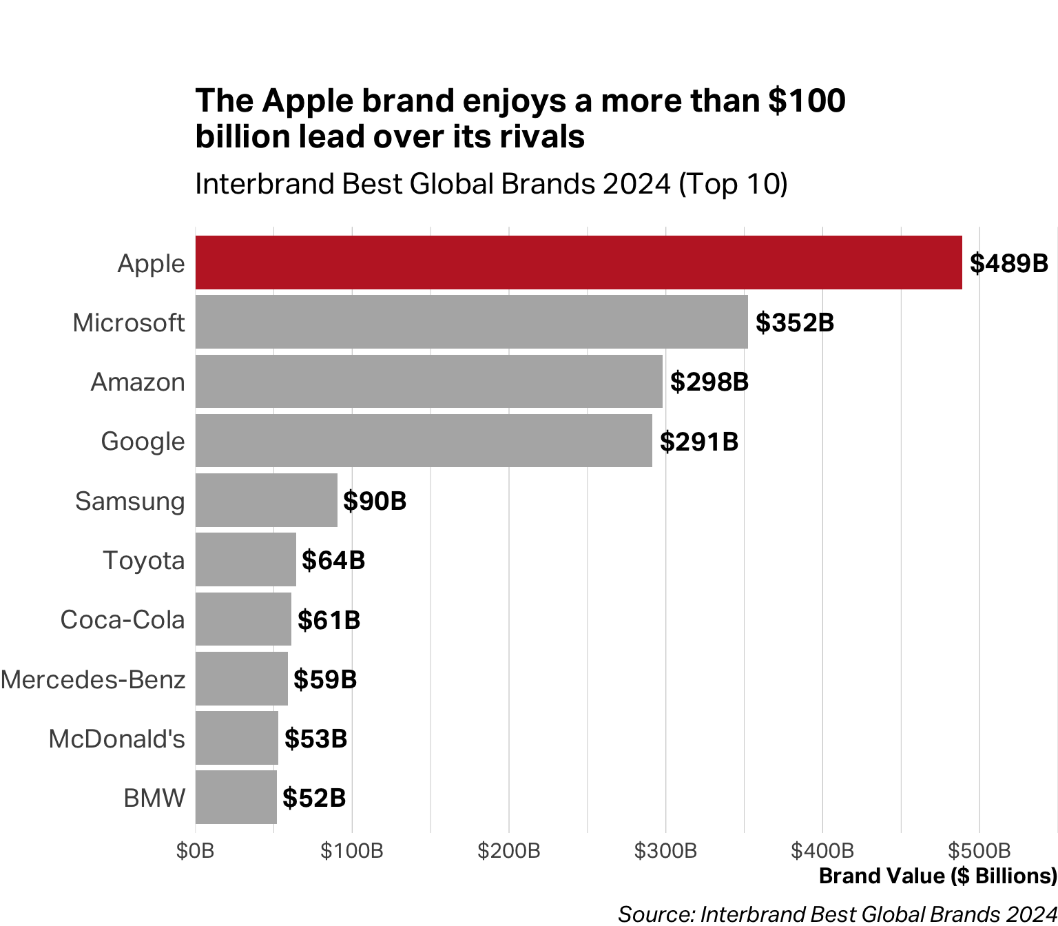
The sentence you articulate can even become the chart’s title. Instead of “Brand Value”, which describes what the chart contains, you can write, “The Apple brand enjoys a more than $100 billion lead over its rivals.” That’s your argument and the chart is proof.
Match the Chart to the Claim
Different claims require different visual forms. The chart that works beautifully for one type of argument will obscure another. Here’s a practical guide organized by what you’re trying to communicate:
When you’re showing a proportion or part-to-whole relationship
Use a pie chart, stacked bar, or stacked area chart. These work when you’re answering questions like “What share of our customers fall into each segment?” or “How has our mix changed over time?” Pie charts work best with 2-4 slices; beyond that, consider a stacked bar. When proportions shift over time, a stacked area chart shows both the composition and the trend.
When you’re making a comparison
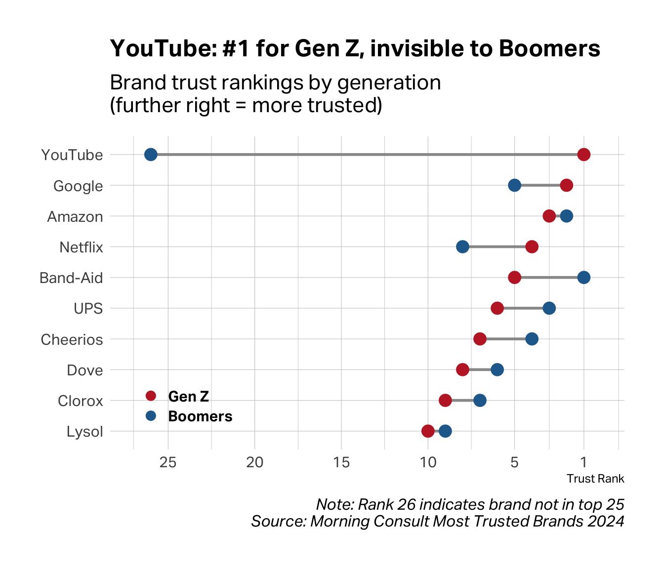
Use a bar chart, dot plot, or dumbbell chart. Horizontal bars work well when you have many categories or long labels. Dumbbell charts—two dots connected by a line—are ideal when comparing exactly two groups across many items; the line draws attention to the gap, which is usually the point.
When you’re showing a distribution
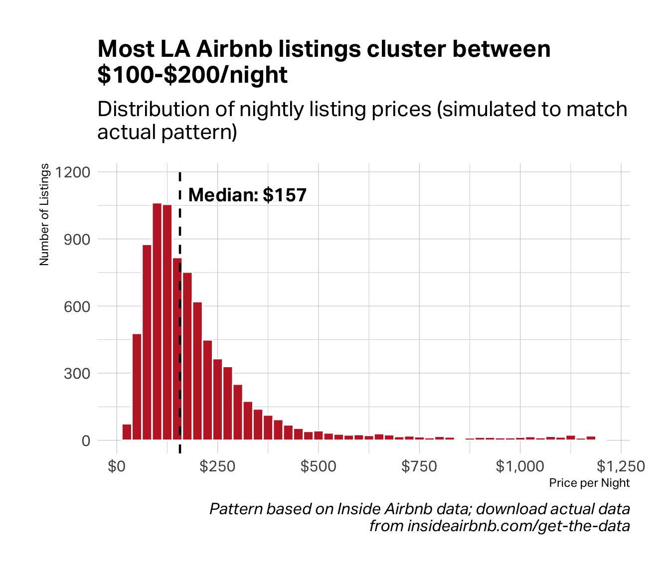
Use a histogram, density plot, or box plot. These reveal how values spread across a range—where they cluster, how much they vary, whether outliers exist. A histogram like the one below shows the shape of your data at a glance. The tall bars on the left tell you where most cases fall, while the long right tail reveals a small group of expensive outliers that the mean alone would obscure.
When you’re showing a relationship between two variables
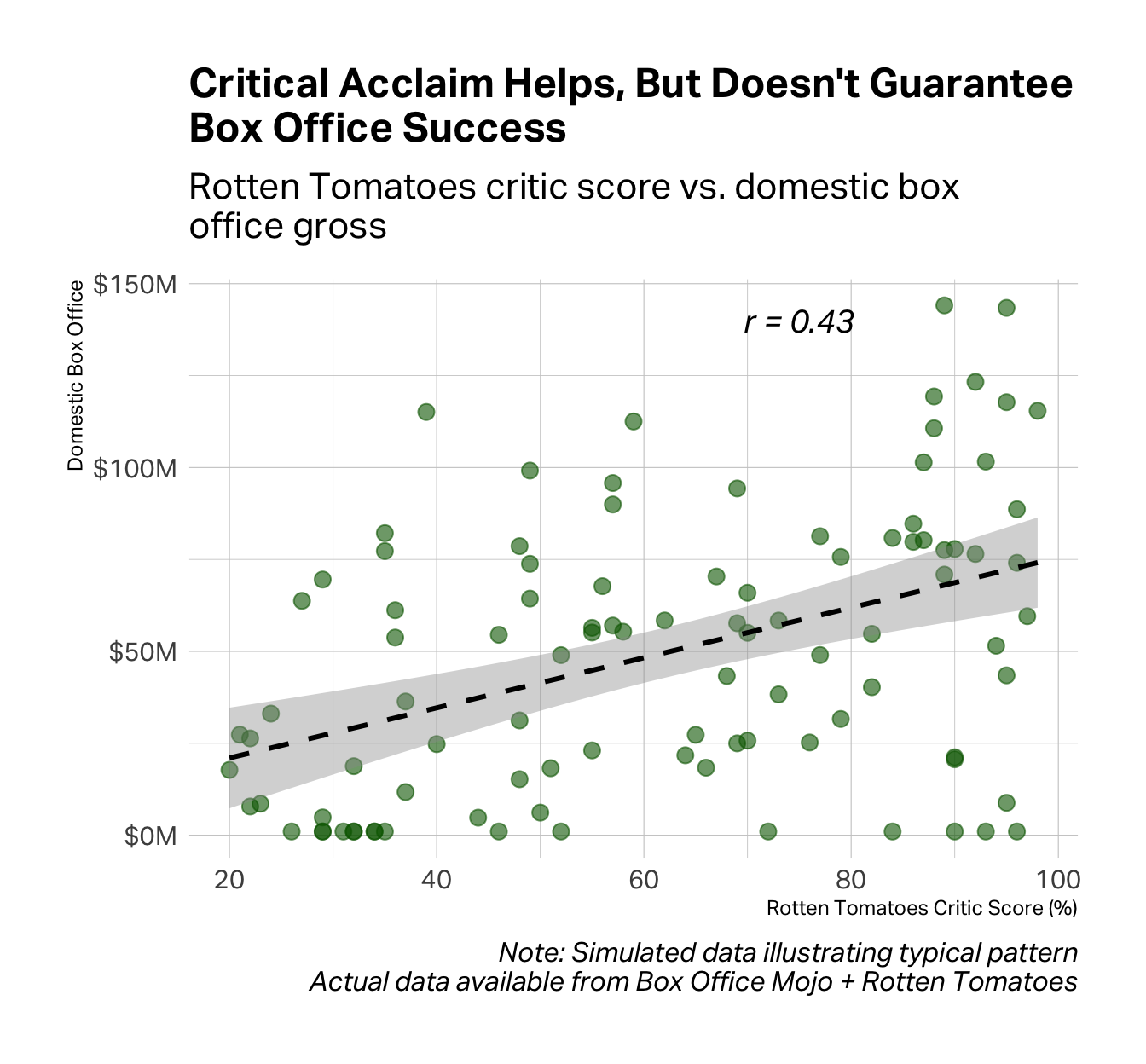
Use a scatter plot. Each dot is one observation; its position reveals whether two variables move together, and how tightly. The chart below shows a moderate relationship (r = 0.43) between critical acclaim and box office performance. Look at the scatter. Plenty of well-reviewed films flopped, and plenty of poorly-reviewed films made money. The correlation exists, but it’s not exactly destiny.
When you’re showing change over time
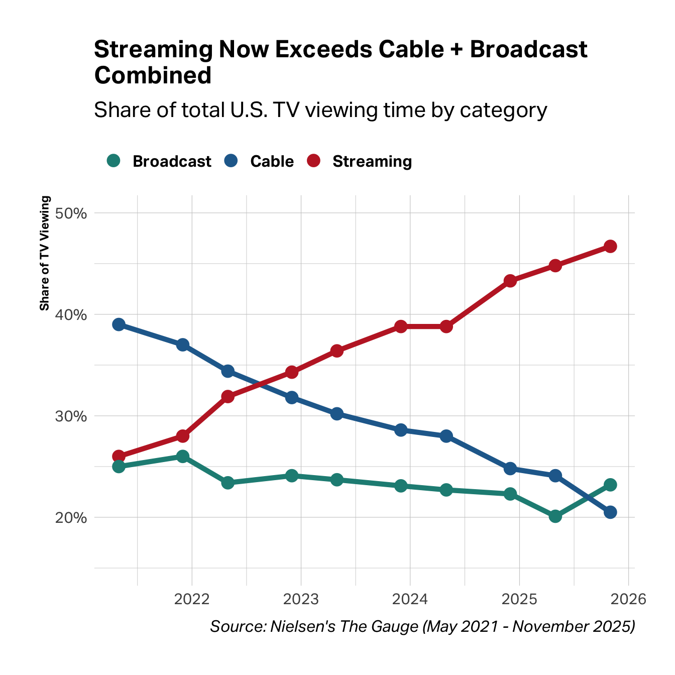
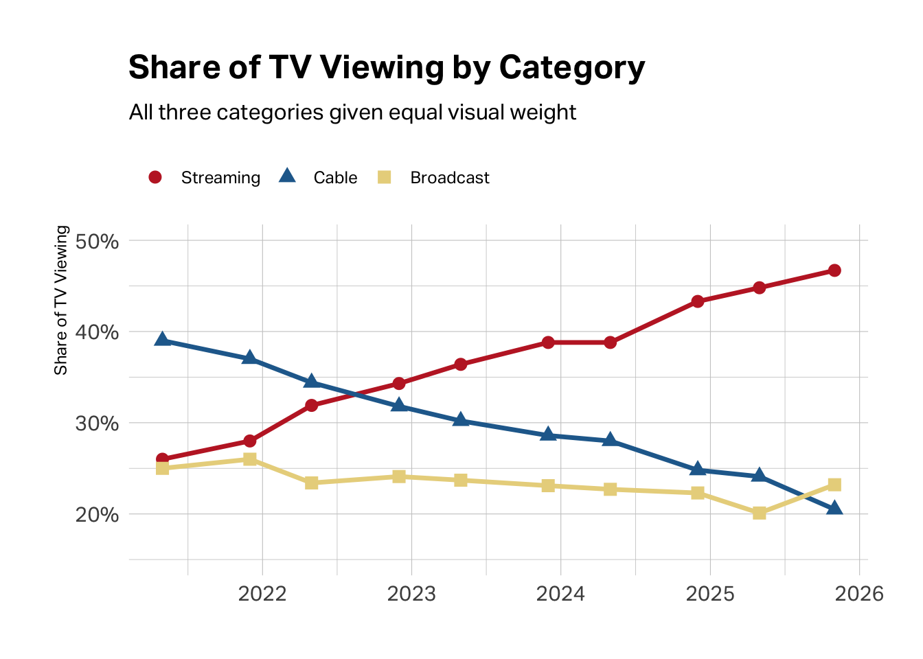
Use a line chart. Lines imply continuity and direction, making them ideal for trends. The chart below tracks four years of TV viewing, and the story is unmistakable. Streaming rose steadily while cable collapsed. You could report the start and end numbers, but the lines show the trajectory, the crossover point, and the relentlessness of the shift.
When you’re comparing scores across many items
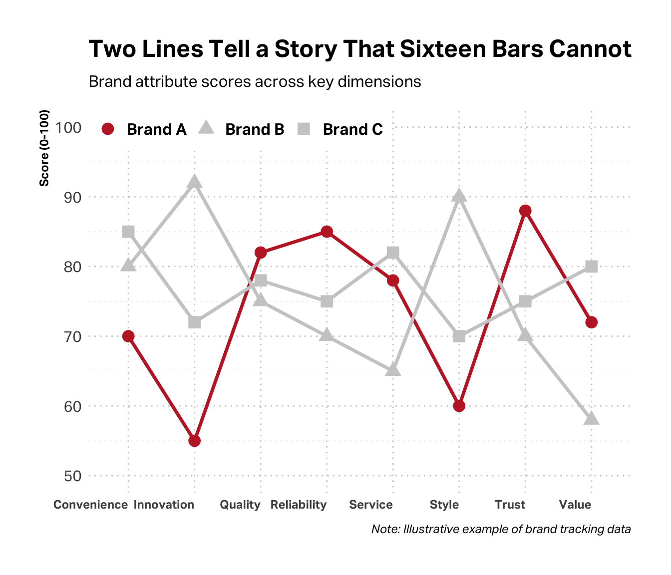
You can use a line chart even if the data isn’t time-series. When you have eight or ten or twenty scale items like brand attributes, satisfaction dimensions, feature ratings, a line connecting the scores is far easier to read than a forest of bars. The peaks and valleys pop. The gaps between brands become obvious. In the chart below, Brand A (highlighted) leads on reliability and trust but lags badly on innovation and style. You see the profile at a glance.
Common Mistakes
Even with the right chart type, execution matters. A few pitfalls to avoid:
Chart junk. Unnecessary gridlines, 3D effects, decorative images, excessive color—all of it distracts from the data. Every element should serve a purpose. If it doesn’t help the audience understand your point, remove it.
Misleading axes. Truncating the y-axis can make small differences look dramatic. Inconsistent scales across charts can make comparisons impossible. Start your axis at zero unless you have a compelling reason not to—and if you don’t, make the truncation obvious.
Wrong chart for the data. Pie charts with twelve slices. Line charts connecting categorical data. Bar charts for continuous distributions. Each of these forces the audience to work harder than necessary to understand your point.
Over-complication. Too many data series on one chart. Dual y-axes that confuse more than clarify. Color coding that requires a legend to decode. When in doubt, simplify. Split one complex chart into two simple ones.
A Quick Primer on Good Design
You don’t need a design degree to make effective slides. But you do need to understand three principles that separate professional presentations from amateur ones: color, typography, and white space.
Color as Emphasis
Color is not decoration—it’s a strategic choice. Every color on your slide should be there for a reason.
Isolation–When one thing matters most.
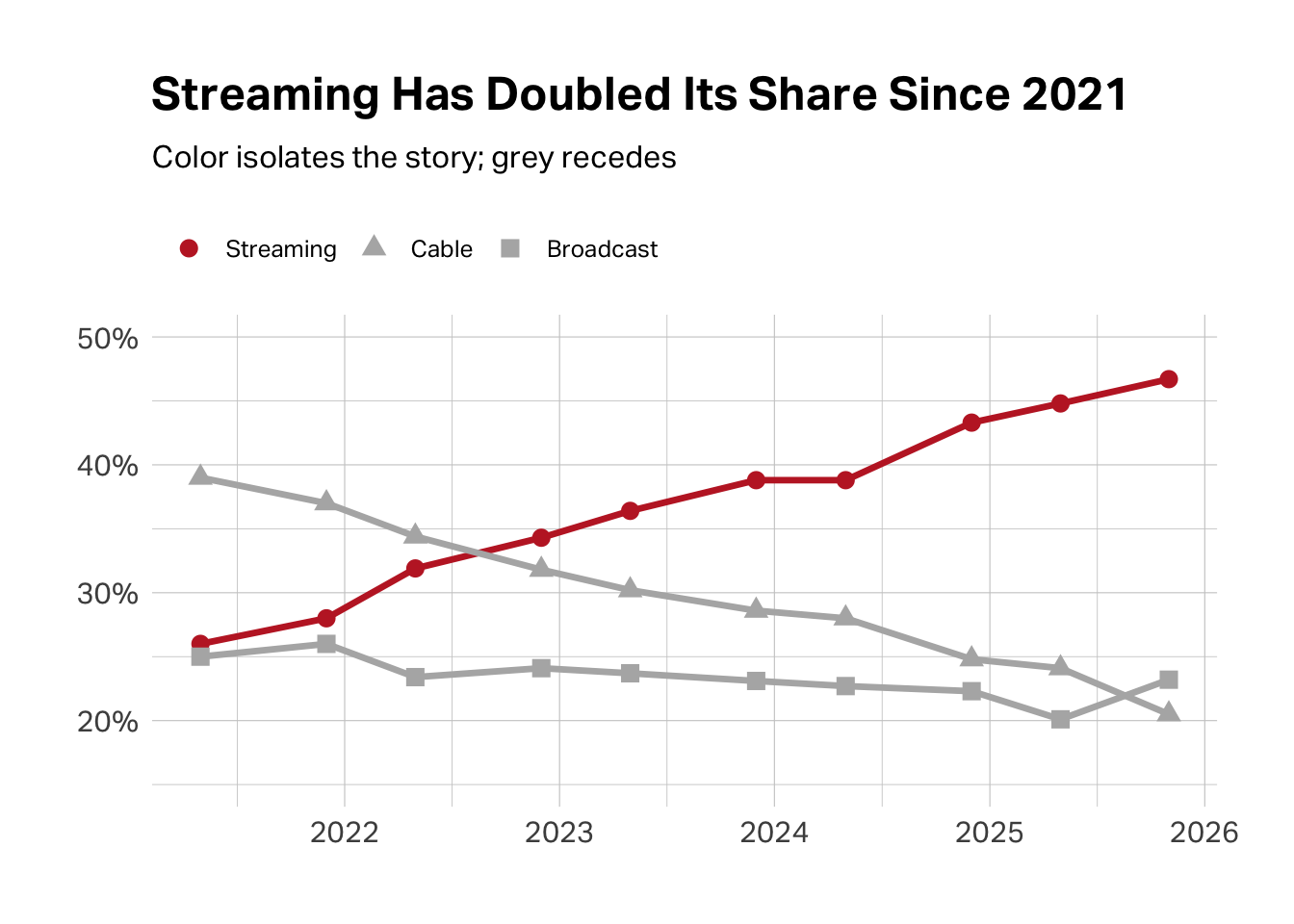
Sometimes the most powerful move is giving color to only what matters and greying out the rest. Look at the two charts below. Both show the same data—the share of TV viewing across streaming, cable, and broadcast from 2021 to 2025. In the first version, all three categories compete for your attention. In the second, streaming pops in red while cable and broadcast fade to grey. Your eye goes exactly where it should: to the line that’s rising. That’s isolation. The data hasn’t changed. The story has sharpened.
Contrast–When you need to show difference.
When comparing two things, choose colors that contrast without clashing. Students often reach for red and green to signal “bad” and “good”—but those are Christmas colors, and they vibrate unpleasantly on screen. Red and blue provide the same visual polarization while actually looking professional. They’re complementary colors—opposites on the color wheel—which is why they work.
Monochromatic–When you need to show gradation.
Sometimes you don’t need different colors at all—you need different shades of the same color. A monochromatic palette (light blue to dark blue, for instance) can show intensity, progression, or hierarchy without the visual noise of a rainbow. Five shades of blue will always look more sophisticated than five random colors.
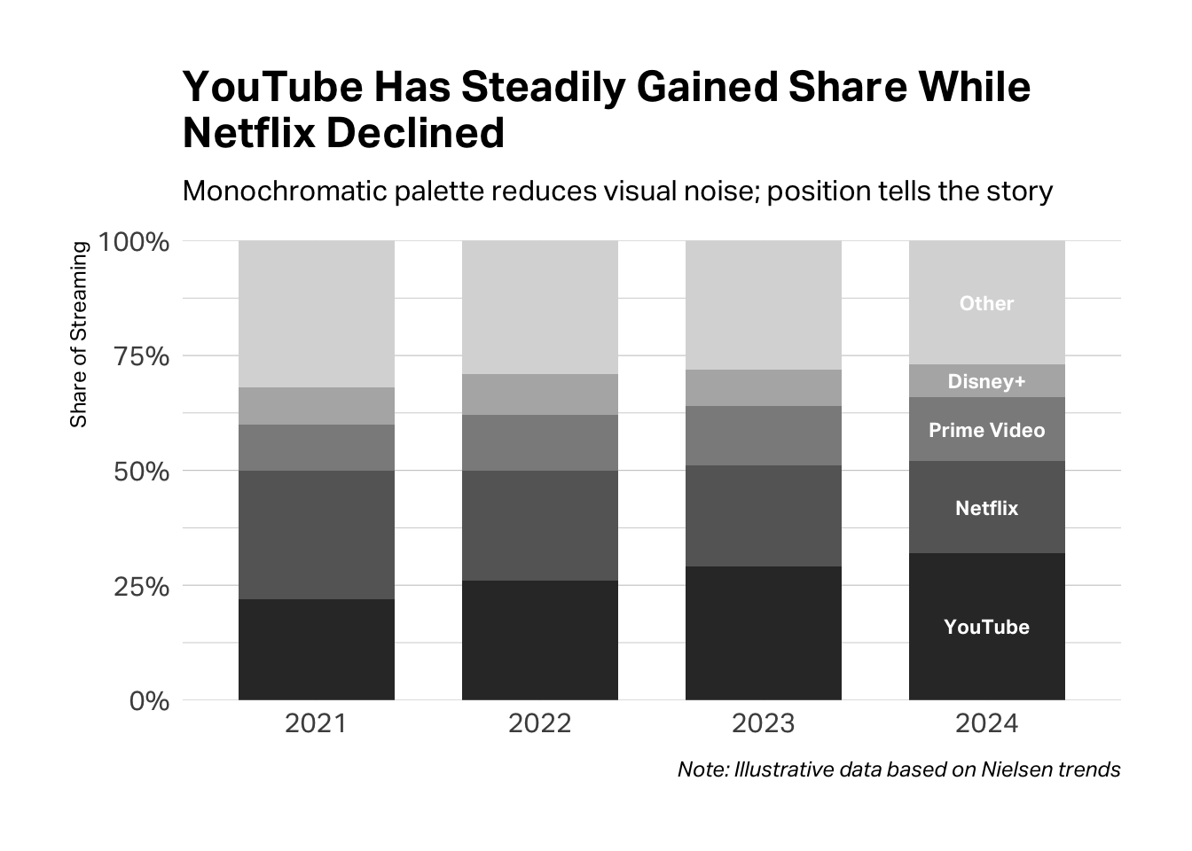
The test. Before you finalize, ask yourself: if I printed this in black and white, would the logic still hold? If your colors are doing real work, the answer should be yes—the structure remains visible, even without the hue.
Typographic Hierarchy
Your audience should know what to read first without thinking about it. That’s the job of typographic hierarchy—using size, weight, and placement to signal importance.
You need three levels, maximum:
- Headline: Big and bold. This is your claim, your finding, your point. It’s what you want them to remember if they forget everything else.
- Supporting text: Medium size, regular weight. Labels, annotations, brief explanations.
- Source and caption: Small and light. The fine print—necessary for credibility, but not competing for attention.
Enterprise Customers Are Twice as Likely to Renew
Renewal rates by segment, Q4 2024 survey (n=1,247)
Source: Internal CRM data matched to post-purchase survey responses
If you’re squinting at your own slide trying to figure out where to look first, your audience will too. When everything is emphasized, nothing is.
White Space
Empty space isn’t wasted space—it’s breathing room. It gives your audience’s eyes a place to rest and signals that what is on the slide actually matters.
The most common mistake is cramming. You have so much to say, and the slide is right there, and surely you can fit one more bullet point if you just shrink the font a little…
Stop. If you’re tempted to shrink the font to fit more content, that’s your signal to split the slide.
Here’s the rule: one idea per slide. Not one topic. One idea. One claim. One chart. One takeaway.
Everything competes for attention.
One idea. Room to breathe.
A 20-slide deck with one idea per slide is dramatically more effective than a 7-slide deck crammed with information. The former respects your audience’s attention. The latter overwhelms it.
Think of white space as confidence. A sparse slide says: This point is important enough to stand alone. A cluttered slide says: I’m not sure what matters, so I included everything.
Putting It Together
When you present research to a decision-maker, you are not narrating your journey through the data. You are making an argument. The Pyramid Principle gives you the structure: answer first, then key arguments, then supporting evidence. Visualization gives you the evidence: charts that show rather than tell, matched to the claims you’re making.
Before your next presentation, try this exercise. Write down, in one sentence, the decision you’re asking your audience to make. Then write down, in three sentences or fewer, the key findings that support your recommendation. If you can’t do this clearly and concisely, you’re not ready to present. If you can, you have your opening—and everything else is support.
Your audience will thank you. They might even put down their phones.
AI Exploration Prompts
Use these prompts with Claude or another AI assistant to deepen your understanding:
“I have survey data showing customer satisfaction scores across four segments. I want to argue that one segment is significantly less satisfied than the others. What’s the best way to visualize this, and what should my chart title be?”
“I’m presenting research findings to a VP who has 10 minutes. Help me structure my presentation using the Pyramid Principle. My main finding is [X].”
“Look at this chart I’ve created. Does it clearly support a specific claim? How could I simplify it or make the argument clearer?”
Further Resources
Minto, Barbara. The Pyramid Principle: Logic in Writing and Thinking. The original and still definitive treatment of top-down communication.
Duarte, Nancy. Resonate: Present Visual Stories that Transform Audiences. A deeper dive into the structure of persuasive presentations.
Yau, Nathan. Visualize This: The FlowingData Guide to Design, Visualization, and Statistics. Excellent for understanding the impact of different data visualizations, with voluminous code examples across platforms from Excel to Python. Yau also maintains a website FlowingData with lots of free content and examples.
From Data to Viz. An interactive decision tree that recommends chart types based on your data structure.
Knaflic, Cole Nussbaumer. Storytelling with Data. Excellent treatment of visualization principles with many before/after examples.
Deep Cut
If you’re really brave, read The Visual Display of Quantitative Information by Edward Tufte. Tufte has strong opinions about information design—including a famous devotion to the Bembo typeface that trickles into these Teaching Notes—but his ideas about chart junk, data-ink ratio, and small multiples have shaped how an entire generation thinks about visualization.