| Data Dictionary | ||
| Variable | Type | Description |
|---|---|---|
| customer_id | ID | Unique customer identifier |
| locations_visited | Numeric | Number of distinct store locations visited |
| days_since_last_visit | Numeric | Recency: days since last transaction |
| days_since_first_visit | Numeric | Tenure: days since first transaction |
| pct_food_purchases | Numeric | Proportion of transactions that included food |
| total_transactions | Numeric | Lifetime transaction count |
| profit_per_transaction | Numeric | Average profit contribution per transaction |
| loyalty_member | Binary | Enrolled in unlimited drink subscription (1 = yes) |
| buys_whole_bean | Binary | Purchases whole bean coffee (1 = yes) |
| uses_wifi | Binary | Uses in-store WiFi (1 = yes) |
| imp_social_mission | Likert 1–5 | Importance of the company's social mission |
| imp_coffee_quality | Likert 1–5 | Importance of coffee quality |
| imp_store_comfort | Likert 1–5 | Importance of store comfort and atmosphere |
| imp_food_variety | Likert 1–5 | Importance of food variety |
| imp_wifi_speed | Likert 1–5 | Importance of WiFi speed and reliability |
| is_local_resident | Binary | Lives near primary store (1 = yes) |
| follows_on_social | Binary | Follows the brand on social media (1 = yes) |
| nps | Numeric | Net Promoter Score (0–10) |

Cluster Analysis: Finding Segments in Survey Data
Teaching Note
You’ve just fielded a customer survey for a regional coffee chain. You have 1,342 respondents. For each, you have behavioral data from the company’s CRM (how many stores they’ve visited, how long they’ve been a customer, whether they’re a loyalty member) alongside survey responses rating the importance of attributes like coffee quality, store comfort, and WiFi speed. Your client wants to know, “Who are the different types of customers in our market, and what do they care about?”
This is one of the most common—and most consequential—questions in marketing research. And the technique most often used to answer it is cluster analysis.
Clustering is an unsupervised technique, which means you aren’t predicting anything. There’s no dependent variable. Instead, you’re asking the algorithm to examine the patterns in your data and group respondents who look similar to one another. The result is a set of clusters—groups of people whose responses are statistically closer to each other than they are to people in other groups.
The most familiar application is market segmentation, but the logic extends well beyond that. You can cluster respondents in a satisfaction study to find distinct experience profiles. You can cluster students in an exit survey to understand different motivational types. Anywhere you suspect your sample contains meaningfully different groups of people, clustering can help you find them.
The Practice Dataset
The data accompanying this note (coffee-customer-survey.csv) contains 1,342 customers of a coffee chain. Each row combines CRM behavioral data with survey responses.
Notice the range of variable types: continuous behavioral metrics that span from 1 to 784, Likert scales with only 5 levels, and binary indicators. This is typical of real survey data. As you will see below, this is why pre-processing your data can be so important.
Why You Can’t Just Eyeball It
With two or three variables, you can sometimes spot groups visually. Plot respondents on a scatterplot and the clusters jump out. But this dataset has 17 variables, and the groupings exist in a high-dimensional space that no scatterplot can capture. That’s where algorithms come in. They do mathematically what your eyes can’t. They compute the distances between every pair of respondents across all variables simultaneously, and find the groupings that minimize the variance within clusters while maximizing the variance between them.
This is also why clustering is best done in statistical software rather than in Excel. While it is technically possible to compute Euclidean distances and iterate through centroid assignments in a spreadsheet, the process is tedious, error-prone, and effectively impossible once you have more than a handful of variables or respondents. The code examples in this note use R and Python. If you’re working in either language, you may be surprised to learn that clustering is usually only a few lines of code. If you’re working in Excel, this is a good reason to make the jump.
Pre-Processing: Get Your Data Ready
Before you hand your data to a clustering algorithm, you need to deal with the possibility (and usual reality) that your variables aren’t on the same scale. In this dataset, days_since_first_visit ranges from 1 to 784 while imp_coffee_quality ranges from 1 to 5. If you cluster on the raw values, the algorithm will treat tenure as overwhelmingly more important than any survey item—not because it is more important, but because its distances are numerically larger.
The fix is standardization–subtract the mean and divide by the standard deviation for each variable, so every variable has a mean of 0 and a standard deviation of 1.
library(tidyverse)
library(tidymodels)

df <- read_csv("coffee-customer-survey.csv")

# Select clustering variables and standardize
CLUSTER_VARS <- c(
  "locations_visited", "days_since_last_visit", "days_since_first_visit",
  "pct_food_purchases", "total_transactions", "profit_per_transaction",
  "imp_social_mission", "imp_coffee_quality", "imp_store_comfort",
  "imp_food_variety", "imp_wifi_speed"
)

df_scaled <- df |>
  select(all_of(CLUSTER_VARS)) |>
  mutate(across(everything(), \(x) as.numeric(scale(x))))
import pandas as pd
from sklearn.preprocessing import StandardScaler
df = pd.read_csv("coffee-customer-survey.csv")
# Select clustering variables and standardize
CLUSTER_VARS = [
"locations_visited", "days_since_last_visit", "days_since_first_visit",
"pct_food_purchases", "total_transactions", "profit_per_transaction",
"imp_social_mission", "imp_coffee_quality", "imp_store_comfort",
"imp_food_variety", "imp_wifi_speed"
]
scaler = StandardScaler()
df_scaled = pd.DataFrame(
scaler.fit_transform(df[CLUSTER_VARS]),
columns=CLUSTER_VARS
)If you skip this step, you’ll make one of the most common mistakes in cluster analysis and you will end up with distorted results.
Notice that we selected a subset of variables for clustering—the behavioral and attitudinal variables—and left out customer_id, the binary indicators, and nps. These holdout variables become valuable later when we profile the clusters. Choosing what to cluster on is an analytical decision, not a default. You should cluster on the variables that represent the differences you care about, then use everything else to describe the groups you find. This is also where the psychological aspect we discuss so often in class comes to play. Some students throw every variable into the algorithm. Why not? More data might lead to better clusters. Except, in some cases, that will make no sense at all. You want to carefully select the variables you wish to cluster upon. They should be tied to theoretical differences you might expect in customer attitudes, motivations, behaviors, and preferences.
One important caveat: standardize for clustering, but profile on original scales. Once you’ve assigned respondents to clusters, switch back to the original data for profiling and presentation. A vice president doesn’t want to hear that Segment A scored 1.3 standard deviations above the mean on price sensitivity. They want to hear that Segment A rated coffee quality a 4.6 out of 5. Scaled values are essential for the algorithm. Original values are essential for the audience.
Advanced: Pre-Processing with PCA
If you have many clustering variables, the distances between respondents become harder for any algorithm to parse cleanly—a problem sometimes called the curse of dimensionality. One solution is to first reduce your variables using Principal Components Analysis (PCA), then cluster on the resulting components rather than the raw variables.
PCA transforms your correlated variables into a smaller set of uncorrelated components. The first component explains the most variance, the second explains the next most, and so on. If enough of your data is explained by just the first two components, you can plot every respondent on a two-dimensional scatterplot. This is one of the great benefits to this pre-processing approach. It has the added benefit that those two macro-variables are virtually uncorrelated. This gives you a powerful way to visualize your clusters on a 2×2 plane—something that’s often impossible with the raw variables. In my own work, I often run PCA first just to get the visualization, even when I could cluster directly on the scaled data.
# Run PCA on scaled data
pca_result <- prcomp(df_scaled, scale. = TRUE)


# Add the PCA scores onto our dataframe
df <- augment(pca_result, df)
from sklearn.decomposition import PCA
pca = PCA(n_components=2)
pca_scores = pd.DataFrame(
pca.fit_transform(df_scaled),
columns=["PC1", "PC2"]
)
print(f"Variance explained by PC1 + PC2: {pca.explained_variance_ratio_.sum():.1%}")If the first two components explain less than about 40% of the variance, the resulting plot will be a noisy approximation. You can still cluster on more components, but you lose the clean 2D visualization.
Sometimes, I find it useful to view my clustered variables in a PCA plot.
pca_tidy <- pca_result |>
  tidy(matrix = "rotation")

pca_tidy |>
  pivot_wider(
    names_from = "PC",
    names_prefix = "PC",
    values_from = "value"
  ) |>
  ggplot(aes(x=PC1, y=PC2)) +
  geom_segment(
    xend = 0,
    yend = 0,
    arrow = arrow(ends = "first", length = unit(6, "pt"))
  ) +
  geom_label_repel(aes(label = column), size=5) +
  theme(
    plot.margin = margin(0, 0, 0, 0),
    plot.title.position = "plot"
  ) +
  labs(
    title = "PCA Plot of Scaled Variables",
    subtitle = "Coffee Customer Dataset"
  )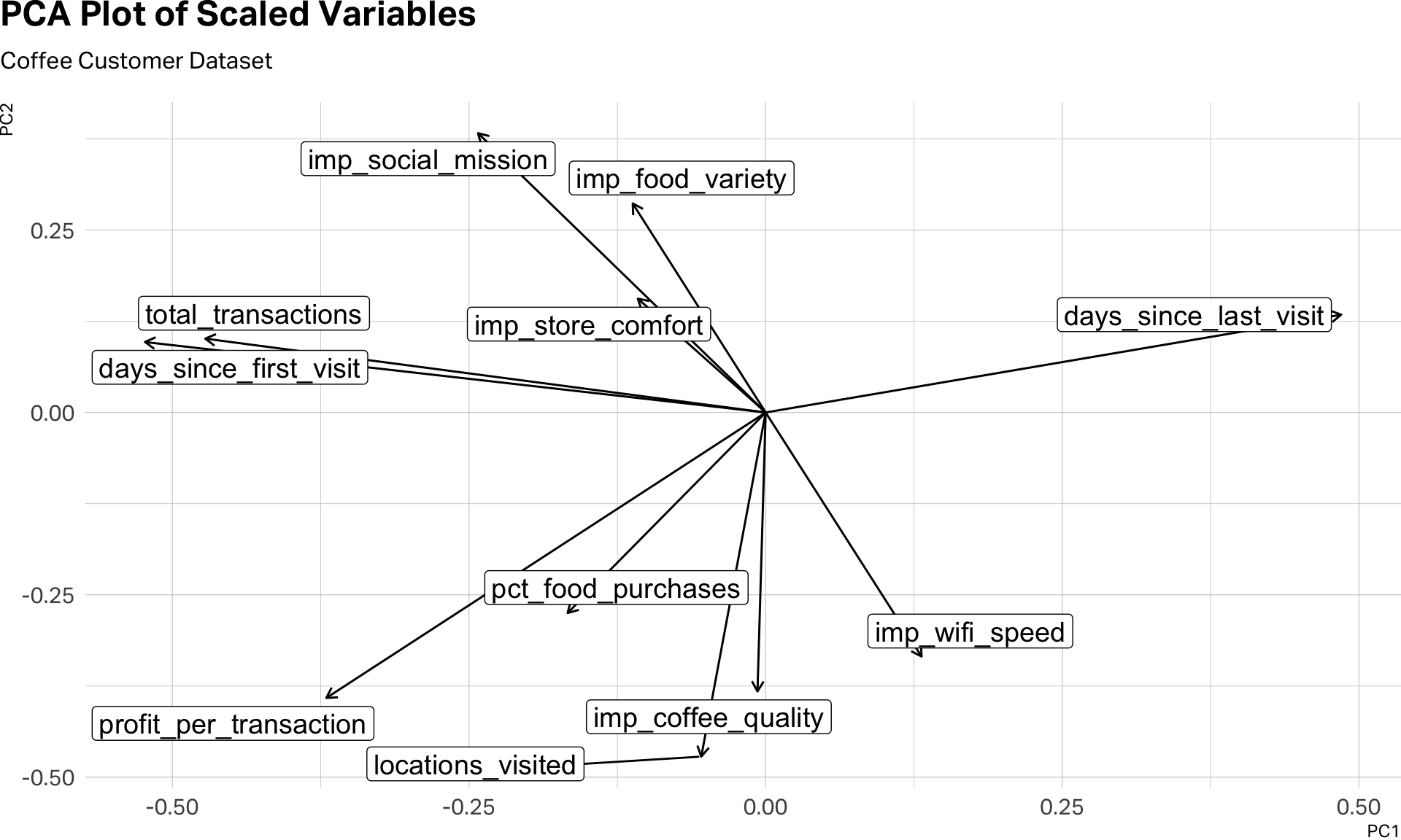
This visual inspection can help us see the clusters before we even begin clustering. Notice the five variables that gather together in the southern part of this plot. Also, the two variables–days_since_first_visit and total_transactions that seem to be traveling to gather in the northwestern quadrant. And then, days_since_last_visit, which seems to be doing its own thing.
A further note on mixed data: this dataset combines continuous variables with Likert scales and binary indicators. A technique called Factor Analysis of Mixed Data (FAMD) handles this by running PCA on the numeric variables and Multiple Correspondence Analysis on the categorical ones, then combining the results. It’s more principled but also more complex, and beyond the scope of this note.
K-Means: The Workhorse
K-means is the most widely used clustering algorithm in marketing research, and for good reason—it’s fast, intuitive, and works well with the kind of rectangular survey data you’ll encounter in practice.
The algorithm is simple in concept. You tell it how many clusters you want (K). It randomly assigns K starting points (called centroids), assigns each respondent to the nearest centroid, then recalculates the centroids based on the respondents assigned to them. It repeats this process until the assignments stabilize. The result is K groups of respondents, each defined by its centroid—the average profile of the cluster.
But you have to tell K-means how many clusters to look for. It won’t figure that out on its own. You can, of course, use a scree plot or a silhouette plot to estimate the optimal number of clusters. With statistical software, we can easily apply an iterative approach.
How Many Clusters? The Iterative Approach
The right number of clusters isn’t something you calculate once. You run the algorithm multiple times—with K=2, K=3, K=4, and so on—and evaluate each solution. The code below runs K-means for eight different values of K on our coffee dataset.
set.seed(42)
kclusts <- tibble(k = 1:8) |>
mutate(
clust = map(k, ~ kmeans(df_scaled, centers = .x, nstart = 25)),
tidied = map(clust, tidy),
glanced = map(clust, glance),
augmented = map(clust, augment, df)
)
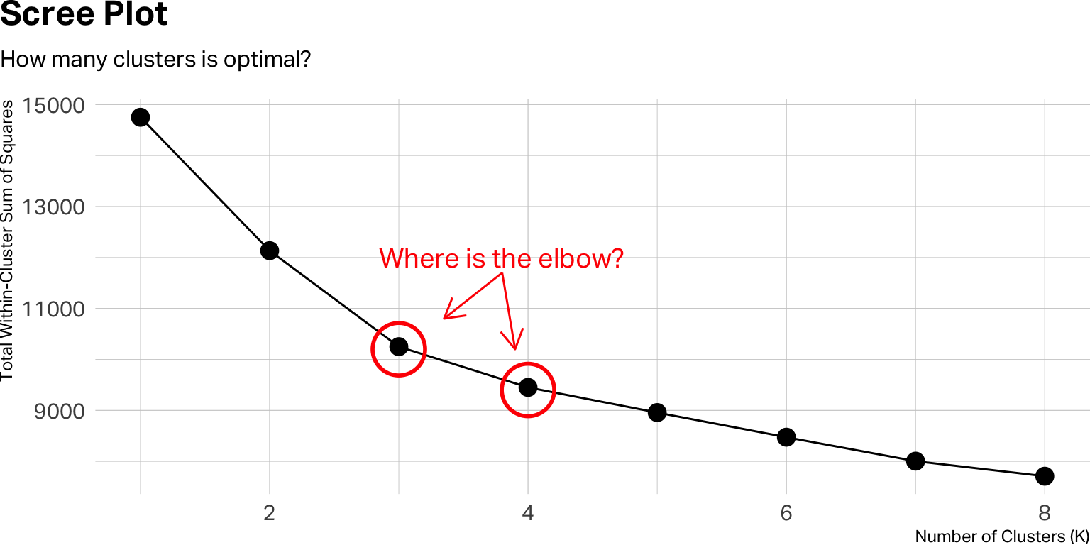
# Scree plot
kclusts |>
unnest(glanced) |>
ggplot(aes(x = k, y = tot.withinss)) +
geom_line(group = 1) +
geom_point(size = 4) +
annotate("point", x = 3, y = 10200, size = 12, shape = 1, stroke = 1.5, color = "red") +
annotate("point", x = 4, y = 9400, size = 12, shape = 1, stroke = 1.5, color = "red") +
annotate("text", x= 3.8, y=12000, label="Where is the elbow?", color = "red", size=5) +
annotate("segment", x=3.8, xend=3.35, y=11700, yend=10800, arrow = arrow(ends = "last", length = unit(12, "pt")), color="red") +
annotate("segment", x=3.8, xend=3.9, y=11700, yend=10200, arrow = arrow(ends = "last", length = unit(12, "pt")), color="red") +
theme(
plot.margin = margin(0, 0, 0, 0),
plot.title.position = "plot"
) +
labs(
title = "Scree Plot",
subtitle = "How many clusters is optimal?",
x = "Number of Clusters (K)",
y = "Total Within-Cluster Sum of Squares"
)
from sklearn.cluster import KMeans
import matplotlib.pyplot as plt

inertias = []
K_range = range(1, 9)

for k in K_range:
    km = KMeans(n_clusters=k, n_init=25, random_state=42)
    km.fit(df_scaled)
    inertias.append(km.inertia_)

plt.figure(figsize=(8, 4))
plt.plot(K_range, inertias, marker="o")
plt.xlabel("Number of Clusters (K)")
plt.ylabel("Total Within-Cluster Sum of Squares")
plt.title("Scree Plot")
plt.show()
A few things worth unpacking. In the R version, you’re creating a tibble with one row per value of K. For each K, you run kmeans() with nstart = 25—which means the algorithm runs 25 times with different random starting points and keeps the best result. This is important because K-means is sensitive to its initial seed; running it once can produce an unstable solution. The Python equivalent achieves the same with n_init=25. Then the R code tidies the output three ways: tidy() gives you the cluster centroids, glance() gives you the overall fit statistics, and augment() attaches the cluster assignments back to your original data. This is the pattern I use in all of my segmentation work.
The y-axis of the scree plot shows the total within-cluster sum of squares—a measure of how tightly packed each cluster is. As K increases, this number always goes down. What you’re looking for is the elbow: the point where adding another cluster stops producing a meaningful improvement. If the curve bends sharply at K=3 and then flattens, three clusters may be your starting point.
But the scree plot is only a guide, not a verdict. A clear elbow is the exception, not the rule. In practice, you’ll often find yourself choosing between two or three plausible solutions. When that happens, the deciding factor should be interpretability: which solution produces clusters that make sense for your research question and can be described in a way that a decision-maker would find actionable?
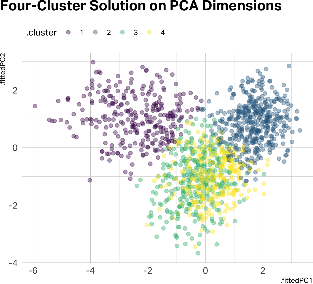
If you pre-processed with PCA and retained two components, this is where the 2D visualization pays off:
# Visualizing clusters on PCA dimensions
kclusts |>
  unnest(augmented) |>
  filter(k == 3) |>
  ggplot(aes(x = .fittedPC1, y = .fittedPC2, color = .cluster)) +
  geom_point(alpha = 0.4, size = 2) +
  scale_color_viridis_d() +
  theme(
    plot.margin = margin(0, 0, 0, 0),
    plot.title.position = "plot",
    legend.position = "top",
    legend.justification = "left"
  ) +
  labs(title = "Three-Cluster Solution on PCA Dimensions")
kclusts |>
  unnest(augmented) |>
  filter(k == 4) |>
  ggplot(aes(x = .fittedPC1, y = .fittedPC2, color = .cluster)) +
  geom_point(alpha = 0.4, size = 2) +
  scale_color_viridis_d() +
  theme(
    plot.margin = margin(0, 0, 0, 0),
    plot.title.position = "plot",
    legend.position = "top",
    legend.justification = "left"
  ) +
  labs(title = "Four-Cluster Solution on PCA Dimensions")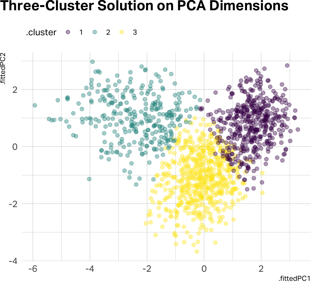
km_final = KMeans(n_clusters=4, n_init=25, random_state=42)
pca_scores["cluster"] = km_final.fit_predict(df_scaled).astype(str)

fig, ax = plt.subplots(figsize=(8, 6))
for cl, group in pca_scores.groupby("cluster"):
    ax.scatter(group["PC1"], group["PC2"], alpha=0.4, s=15, label=f"Cluster {cl}")
ax.legend()
ax.set_title("Four-Cluster Solution on PCA Dimensions")
plt.show()
Notice how there is significant data overlap in the four-cluster solution. Let’s go with three clusters for the remainder of this analysis.
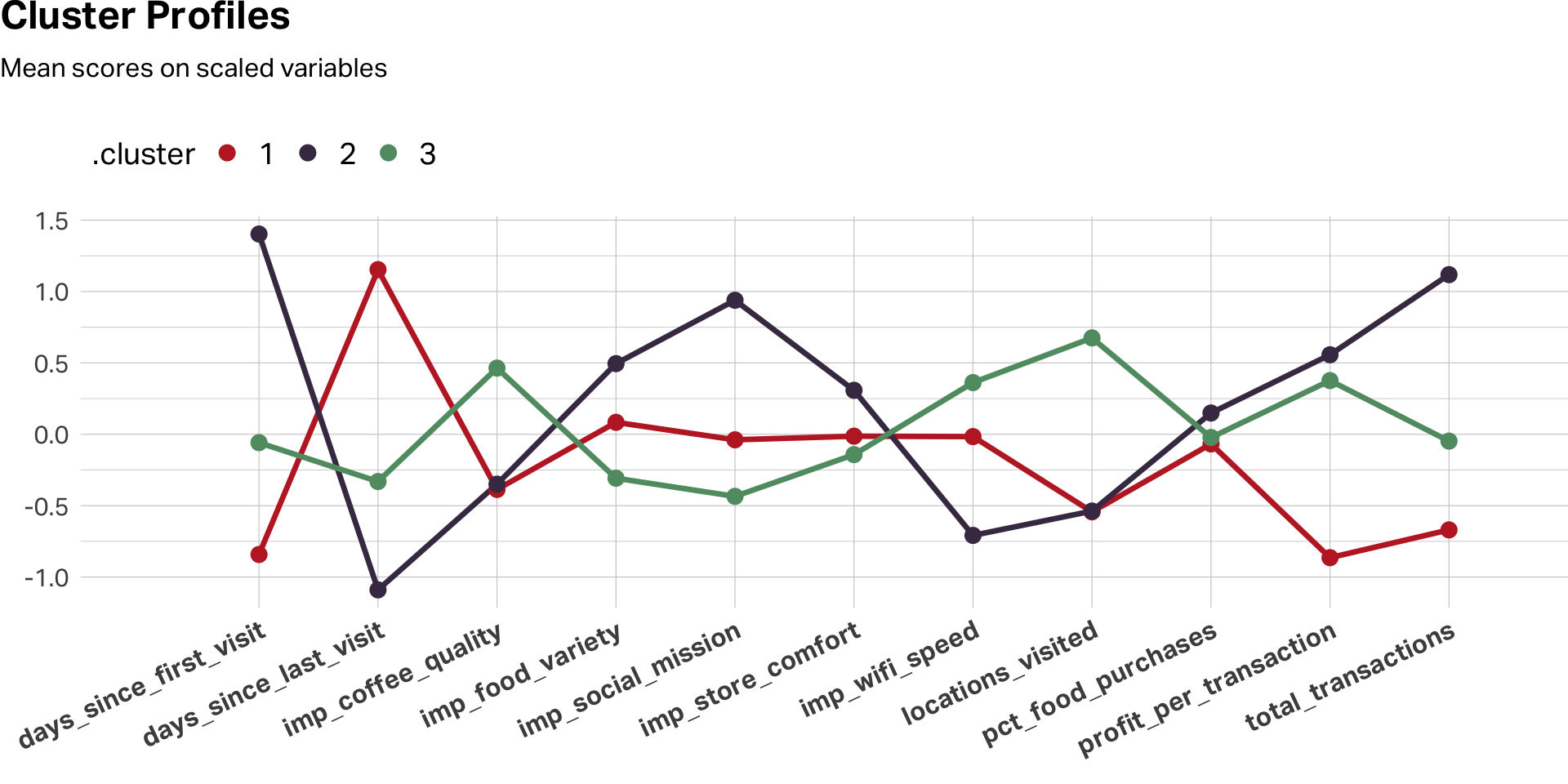
Profiling: Making Clusters Meaningful
Once you’ve chosen a K and assigned respondents to clusters, the real analytical work begins. Cluster assignments by themselves are just numbers. Your job is to profile the clusters—describe them in terms that illuminate who these people are and how they differ.
Start by comparing the cluster means on the variables you used for clustering. Remember: your best practice is to profile on the original, unscaled data. When you tell a product manager that Segment B rated coffee quality a 4.6 out of 5, they know exactly what that means. When you tell them the z-score was 1.2, you’ve lost them.
For visualization, however, scaling remains useful. A line chart of scaled cluster means across variables makes the relative peaks and valleys pop—it shows you the shape of each segment’s profile:
# Using my favorite color palette here
c8 <- c(
  "#C0292D", "#463752", "#609B71", "#DBA940", "#D4663A", "#9E4B6C", "#7A6880", "#251E2B"
)


k3 <- kclusts |>
  unnest(augmented) |>
  filter(k == 3)

# Profile chart: scaled data for VISUALIZATION
k3 |>
  select(.cluster, all_of(CLUSTER_VARS)) |>
  mutate(across(where(is.numeric), \(x) as.numeric(scale(x)))) |>
  pivot_longer(-.cluster, names_to = "variable", values_to = "score") |>
  group_by(.cluster, variable) |>
  summarise(mu = mean(score), .groups = "drop") |>
  ggplot(aes(x = variable, y = mu, color = .cluster, group = .cluster)) +
  geom_line(linewidth = 1.2, show.legend = FALSE) +
  geom_point(size = 3) +
  scale_color_manual(values = c8[1:3]) +
  scale_x_discrete(expand = expansion(mult = c(0.15, 0.1))) +
  theme(
    plot.margin = margin(0, 0, 0, 0),
    plot.title.position = "plot",
    legend.position = "top",
    legend.justification = "left",
    legend.text = element_text(size = 14),
    legend.title = element_text(size = 14),
    legend.key.height = unit(24, "pt"),
    axis.text.x = element_text(size = 12, face = "bold", angle = 25, hjust = 1)
  ) +
  labs(
    title = "Cluster Profiles",
    subtitle = "Mean scores on scaled variables",
    x = "", y = ""
  )
# Summary table: original data for REPORTING
k3 |>
  group_by(Cluster = .cluster) |>
  summarise(
    N = n(),
    `Avg Profit` = mean(profit_per_transaction),
    `Avg Transactions` = mean(total_transactions),
    `Coffee Quality` = mean(imp_coffee_quality),
    `Store Comfort` = mean(imp_store_comfort),
    NPS = mean(nps),
    .groups = "drop"
  ) |>
  gt() |>
  tab_options(
    table.align = "left"
  ) |>
  fmt_number(columns = `Avg Profit`:`NPS`, decimals = 1) |>
opt_row_striping(row_striping = TRUE)| Cluster | N | Avg Profit | Avg Transactions | Coffee Quality | Store Comfort | NPS |
|---|---|---|---|---|---|---|
| 1 | 450 | −0.1 | 8.8 | 2.5 | 3.3 | 8.4 |
| 2 | 295 | 7.6 | 223.8 | 2.5 | 3.7 | 8.3 |
| 3 | 597 | 6.7 | 83.6 | 3.5 | 3.2 | 8.0 |
k3 = df.copy()
k3["cluster"] = km_final.labels_.astype(str)

# Profile chart: scaled data for VISUALIZATION
scaled_profiles = (
    k3.groupby("cluster")[CLUSTER_VARS]
    .mean()
    .apply(lambda col: (col - col.mean()) / col.std())
)

scaled_profiles.T.plot(marker="o", figsize=(10, 6))
plt.title("Cluster Profiles (Scaled)")
plt.ylabel("Standardized Mean")
plt.xticks(rotation=45, ha="right")
plt.tight_layout()
plt.show()

# Summary table: original data for REPORTING
print(
    k3.groupby("cluster")
    .agg(
        N=("customer_id", "count"),
        avg_profit=("profit_per_transaction", "mean"),
        avg_transactions=("total_transactions", "mean"),
        coffee_quality=("imp_coffee_quality", "mean"),
        store_comfort=("imp_store_comfort", "mean"),
        nps=("nps", "mean")
    )
    .round(1)
)
Then extend the profiling beyond the clustering variables. Remember those variables we held out—loyalty_member, uses_wifi, is_local_resident, follows_on_social, nps? Cross-tabulate them by cluster. This is where the segments come alive. You’re not just saying “these people rated attributes differently.” You’re saying “these people rated attributes differently and they’re mostly loyalty members who live nearby and follow the brand on social media.”
| A Profiling Checklist | ||
| Step | Purpose | What to Look For |
|---|---|---|
| Scale comparison | How big is each cluster? | Are any clusters too small to act on? |
| Clustering variables | What defines each cluster? | Peaks and valleys in the profile chart |
| Demographics | Who are these people? | Age, gender, income, geography |
| Behavioral data | What do they do? | Purchase frequency, tenure, channel preference |
| Satisfaction / NPS | How do they feel? | Differences in loyalty and advocacy |
| Open-ends (if available) | What do they say in their own words? | Qualitative texture to the quantitative profile |
A Few Cautions
Clustering is powerful, but it’s easy to over-interpret. A few things to keep in mind.
K-means will always produce clusters, even if the data doesn’t really contain natural groupings. The algorithm doesn’t tell you whether the clusters are meaningful—that’s your job. Always ask whether the differences between clusters are substantively large enough to matter, not just statistically present.
Cluster solutions can also be unstable. Small changes to the data—removing a few respondents, adding a variable—can shift the results. This is why nstart matters (in R) and n_init matters (in Python), and why it’s good practice to run your analysis on a random split of the data and check whether the same basic structure emerges in both halves.
Finally, remember that clustering is exploratory. It generates hypotheses about the structure of your market. It doesn’t confirm them. If your segmentation identifies a promising cluster of high-value customers, the next step is to validate that segment with additional research—not to build an entire marketing strategy on one cluster solution from one survey.
Further Reading
Venkatesan, R. (2018). Cluster analysis for segmentation. Darden Business Publishing, UV0745. The assigned case reading—clear, concise, and focused on the marketing application.
James, G., Witten, D., Hastie, T., & Tibshirani, R. (2021). An Introduction to Statistical Learning (2nd ed.). Springer. Chapter 12 covers unsupervised learning, including K-means and hierarchical clustering, with excellent visual explanations. A free PDF is available at statlearning.com.
AI Exploration Prompts
- “I loaded the coffee customer dataset and want to run K-means in R [or Python]. Walk me through scaling, running multiple K values, and producing a scree plot.”
- “My scree plot doesn’t show a clear elbow—K=3 and K=4 both look reasonable. What other criteria should I use to decide?”
- “I’ve chosen a four-cluster solution. Help me write profiling code that compares cluster means on the original (unscaled) data and produces a summary table suitable for a presentation.”
- “I want to try PCA before clustering. My first two components explain 38% of the variance. Is that enough, or should I include a third component?”
Note: AI is useful for debugging code and brainstorming analytical approaches, but the interpretation of clusters—deciding what they mean for the business—requires your judgment, not the model’s.